Preview image. Unlock full-res
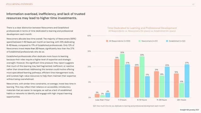
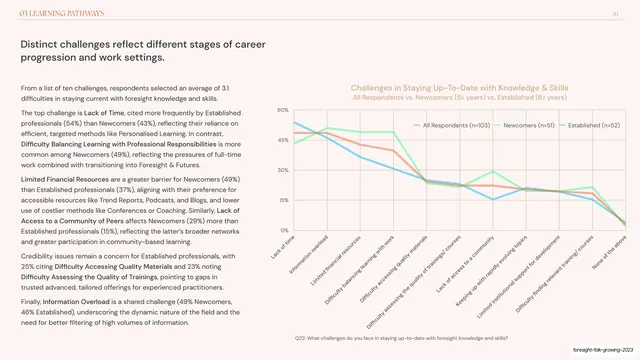
Two-column report slide pairing a left analysis with a right grouped bar chart of three cohorts across five monthly time-investment brackets.
Summary
A Learning Pathways slide using a grouped (clustered) bar chart, three colored bars per bracket, to show how all respondents, newcomers, and established practitioners distribute their monthly learning time.
Visual description
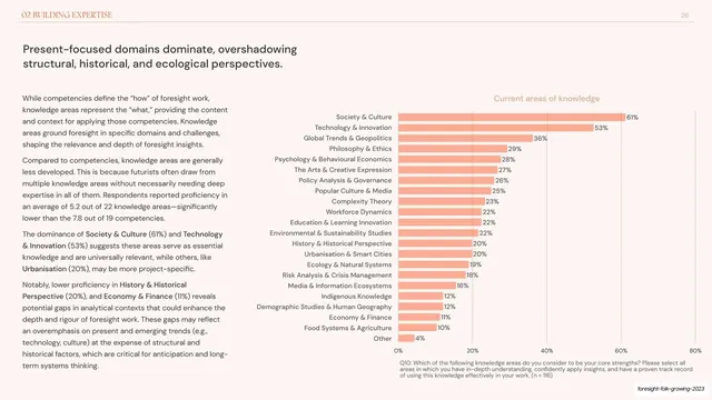
Pale pink-cream background with the orange "03 LEARNING PATHWAYS" running header and page number "42". A two-line dark sans-serif headline ("Information overload, inefficiency, and lack of trusted resources may lead to higher time investments.") sits upper left over three grey paragraphs with bolded figures. The right half is a clustered bar chart titled in soft orange, y-axis 0-50% with irregular gridline labels, and five x-axis brackets (Less than 1 hour, 1-5 hours, 6-10 hours, 11-20 hours, 20+ hours). Each bracket carries three side-by-side bars, orange (All Respondents), green (Newcomers), cyan (Established), each topped with its percentage data label, keyed by a three-item legend and a grey Q21 footnote.
Key takeaway
Per-bar data labels printed above every column, which removes any need to eyeball values against gridlines, plus the same three-color cohort coding carried over from the line slides so the series read identically across chart types.
Reuse notes
Use grouped bars when categories are ordered buckets (here, time ranges) and you want exact cohort-by-bucket comparison. Three bars per group with printed labels stays readable; more than three starts to crowd. Consistent palette and footnote keep it in family with the rest of the chapter.
From this deck: Time dedicated to learning grouped bar chart
View deck















More like this





Keep what you find
A free account saves references to boards and can send you a weekly email of picks based on what you save.
To see every result, go Pro.