Preview image. Unlock full-res
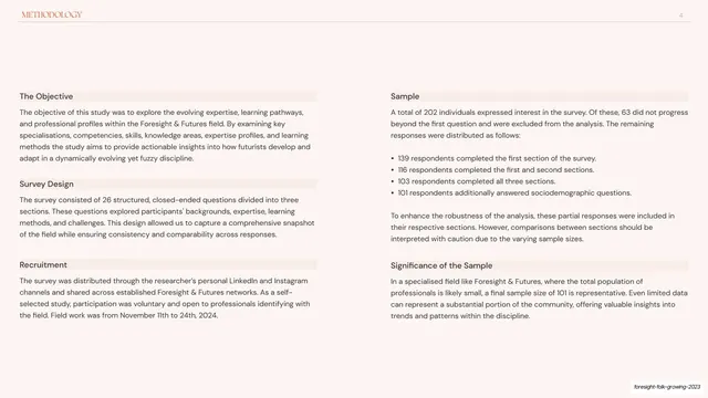
Methodology slide split into two titled panels, each pairing a bold sub-head with explanatory copy or a short stat list.
Summary
The methodology page: a two-column layout where each side carries a bold heading, a sub-head with an underline, and supporting copy, one side narrative, the other a short list of sample figures.
Visual description
Blush-cream ground with a "METHODOLOGY" running header (with a small icon) at top-left and page number "4" at top-right on a hairline rule, this section keyed to a muted blue-grey rather than coral. The body splits into two halves. The left half is headed "The Objective" with sub-heads "Survey Design", "Recruitment" and explanatory paragraphs; the right half is headed "Sample" and "Significance of the Sample", with a short list of response figures (139, 116, 103, 101 respondents) and accompanying notes. Each sub-head sits above a thin rule, and the columns are evenly weighted with comfortable leading.
Key takeaway
Packaging methodology as a tidy two-panel grid with consistent bold-subhead-over-rule labelling, so a dense block of survey detail reads as scannable structure rather than a wall of text. Switching this section to its own blue-grey accent signals you have moved from front-matter into the technical setup.
Reuse notes
Reusable for any methods, scope, or "how we did this" page in a report. The repeated subhead-plus-rule pattern scales to as many sub-sections as you need. Keep the two columns balanced in length so neither side dangles.
From this deck: Methodology two-panel overview
View deck



















More like this





Keep what you find
A free account saves references to boards and can send you a weekly email of picks based on what you save.
To see every result, go Pro.