Preview image. Unlock full-res
Text-left, chart-right data slide with a long coral horizontal bar chart ranking 19 foresight competencies by proficiency.
Summary
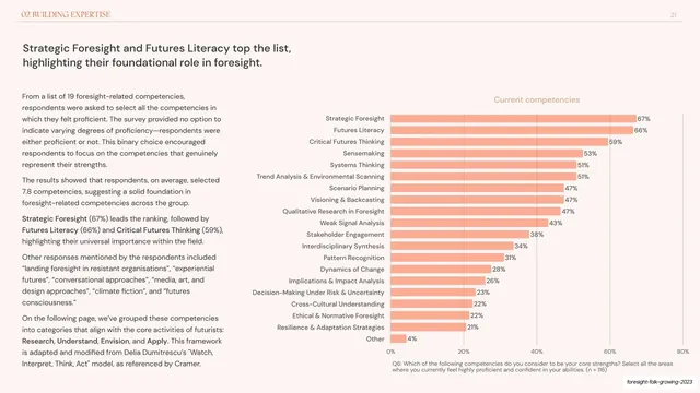
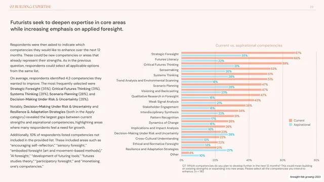
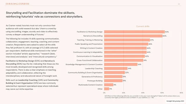
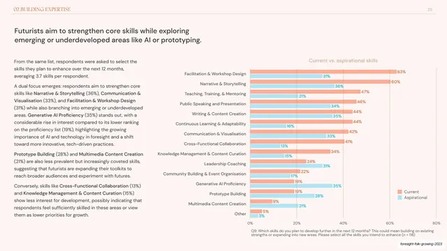
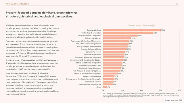
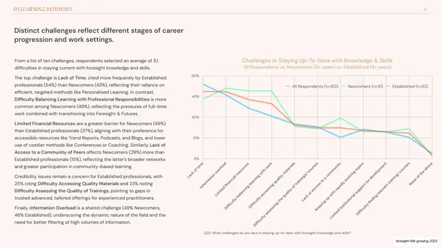
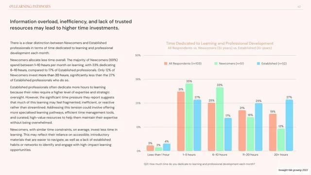
A standard data slide: a two-line dark headline, a left text column of analysis, and a tall coral horizontal bar chart on the right ranking nineteen foresight competencies from Strategic Foresight (67%) down to Other (4%).
Visual description
Light cream background with the running header (chapter label left, "21" right) on a hairline rule. A dark sans headline spans the top. The lower area splits: the left third is two stacked text blocks of dark body copy with a few bold terms; the right two-thirds is a horizontal bar chart titled "Current competencies" in muted coral. Each category label sits flush-right against its salmon-coral bar, with the percentage printed at the bar end. Bars descend in length from 67% to 4%, creating a clean ranked ladder. A small grey question footnote ("Q6: Which of the following competencies...") runs under the chart. Deck-slug annotation bottom-right.
Key takeaway
The repeatable report-slide grammar: short headline, narrow text column, and one large ranked horizontal bar chart with value labels baked onto the bar ends. Single-hue coral bars keep nineteen rows calm and legible, and the survey question printed as a footnote makes the data self-documenting.
Reuse notes
The workhorse layout for survey and research decks reporting one ranked metric per slide. Horizontal bars handle long category labels far better than vertical columns. Keep to one accent color when the row count is high; reserve a second color for grouped or comparison versions.
From this deck: Current competencies horizontal bar chart
View deck















More like this








Keep what you find
A free account saves references to boards and can send you a weekly email of picks based on what you save.
To see every result, go Pro.