Preview image. Unlock full-res
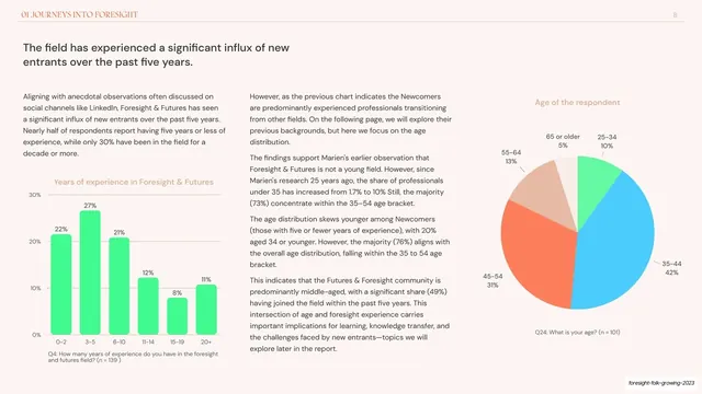
Data slide combining a green bar chart of experience years and a multi-color pie of respondent age beside two columns of copy.
Summary
A two-chart data slide: a green vertical bar chart of years of experience and a multi-color age pie, set against two columns of explanatory copy.
Visual description
Blush-cream ground with the "01 JOURNEYS INTO FORESIGHT" header and page "8" on a hairline rule. The headline "The field has experienced a significant influx of new entrants over the past five years." runs in a dark sans, top-left. The lower-left holds a vertical bar chart, "Years of experience in Foresight & Futures", in bright green with percentage labels (22%, 27%, 21% and so on) and a grey question caption. A column of body copy sits center. The right holds a pie chart, "Age of the respondent", split into green, blue, coral, tan and cream wedges (35-44 at 42% the largest), each labelled with its band and percentage, plus a question caption. Two distributions share one slide without crowding.
Key takeaway
Pairing two different chart types (a distribution bar chart and a composition pie) on one slide to tell a two-part story, while keeping a column of prose between them to carry the argument. The consistent green/blue/coral chart palette ties the two charts together.
Reuse notes
Useful when a single finding needs two cuts of the data at once. Watch density: it works here because the body copy is confined to the center column and the charts sit in opposite corners. Keep the same palette and small-caption convention as the single-chart slides for consistency.
From this deck: Influx of new entrants bar and pie slide
View deck












More like this






Keep what you find
A free account saves references to boards and can send you a weekly email of picks based on what you save.
To see every result, go Pro.