Preview image. Unlock full-res
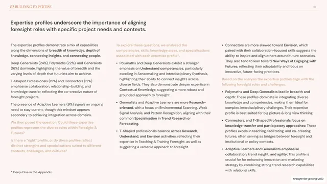
Two-column report slide pairing a dense left analysis with a right multi-line chart of three cohorts across ten knowledge-and-skill challenges.
Summary
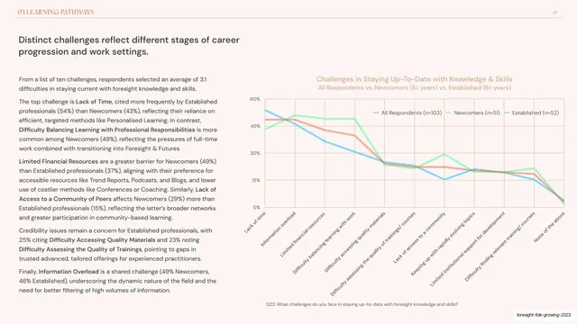
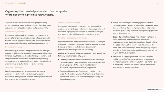
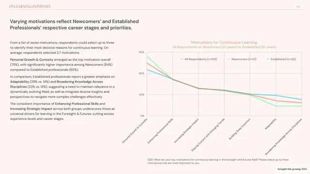
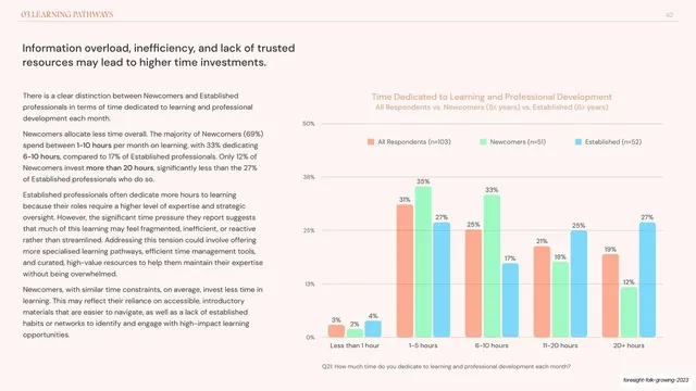
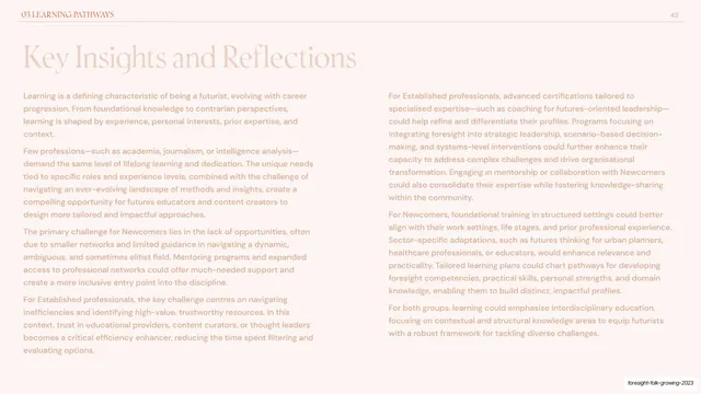
A text-heavy Learning Pathways slide pairing four dense prose paragraphs with a three-series line chart that ranks ten challenges practitioners face in staying current.
Visual description
Pale pink-cream background, orange "03 LEARNING PATHWAYS" running header and page number "41". A two-line dark sans-serif headline ("Distinct challenges reflect different stages of career progression and work settings.") tops a notably dense left column of four grey paragraphs with many bolded challenge names. The right half is a wide line chart titled in soft orange, y-axis 0-60%, with ten long x-axis labels set on a steep diagonal (Lack of time, Information overload, Limited financial resources, Lack of access to a community, and so on). Three crossing lines, orange (All Respondents), green (Newcomers), cyan (Established), are keyed by an inline legend, with a grey Q22 survey-question footnote below.
Key takeaway
Handling ten categories on one axis by tilting the labels almost vertical, which preserves a wide plot area. The left column shows how much analytical copy a single chart slide can carry when the type is small, set in a tight measure, and bolded selectively.
Reuse notes
Reach for this when the analysis is the point and the chart is supporting evidence for a long argument. Ten ranked categories is about the maximum before a line chart turns to spaghetti; lean on bold callouts in the prose. Keep the question-ID footnote for auditability.
From this deck: Challenges staying up-to-date line chart
View deck









More like this






Keep what you find
A free account saves references to boards and can send you a weekly email of picks based on what you save.
To see every result, go Pro.