Preview image. Unlock full-res
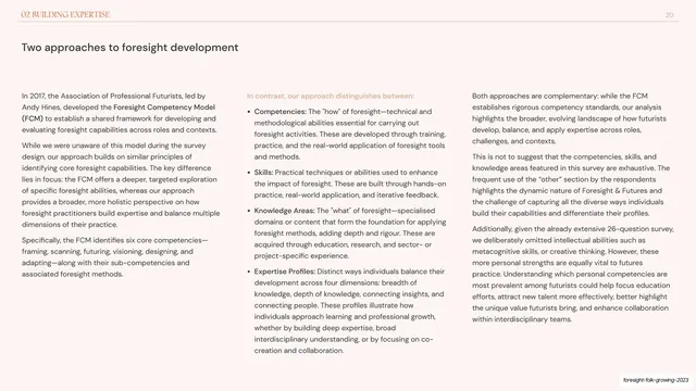
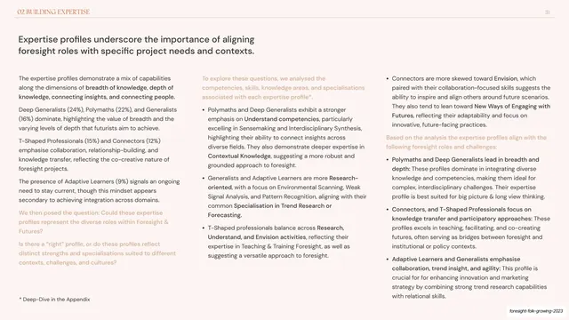
Light slide laying out two approaches to foresight development as three dense columns of body text with bold inline emphasis.
Summary
A dense three-column reading slide titled "Two approaches to foresight development", each column running paragraphs of dark text with key terms bolded inline.
Visual description
Warm off-white background with the running header on a hairline rule: small all-caps "02 BUILDING EXPERTISE" at top-left and page number "20" at top-right. A short dark sans headline sits upper-left. The body fills three near-equal columns of small dark grey text. Within the prose, lead-in phrases and key terms are set in bold ("Competencies", "Skills", "Knowledge Areas", "Expertise Profiles") so each paragraph reads almost like a definition entry. The columns are heavily packed with copy, giving an academic, report-page density. Deck-slug annotation bottom-right.
Key takeaway
Using bold inline lead-ins inside flowing paragraphs to fake a structured definition list without breaking into bullets, letting a very text-heavy slide stay scannable. Three tight columns let a lot of prose live on one page while staying readable.
Reuse notes
For research and report decks that must carry genuinely long explanatory copy. Works as a reading document, not a presentation slide; the type is too small to project. Keep the bold lead-ins consistent so the eye can jump term to term.
From this deck: Two approaches three-column comparison text slide
View deck














More like this







Keep what you find
A free account saves references to boards and can send you a weekly email of picks based on what you save.
To see every result, go Pro.