Preview image. Unlock full-res
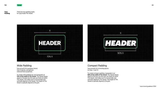
Two grid diagrams contrasting wide and compact type padding inside The Vessel using a HEADER placeholder.
Summary
A type-padding page comparing wide and compact padding for text set inside The Vessel, demonstrated with a white "HEADER" placeholder on grids.
Visual description
Black background, green "7.0" / "Vessel" header, white "66" top-right, and a "Type Padding" sidebar label with a short note. Two black grid panels each hold a green-outlined Vessel with a white "HEADER" word and an "X" width dimension line above. Left panel: upright "HEADER" sitting loosely with a "70% X" measure, captioned "Wide Padding" (evergreen brand and general entertainment, type at 70% of Vessel width). Right panel: an italic "HEADER" nearly filling the frame with a "90% X" measure, captioned "Compact Padding" (sports on Hulu + Live TV, type at 90% of Vessel width).
Key takeaway
Expressing internal padding as a percentage of the container's own width and showing both ratios with the same dimension annotation, so the rule is proportional and self-documenting. The single "HEADER" stand-in keeps focus on spacing, not copy.
Reuse notes
A precise reference for how tightly text should sit inside a framed element. The percentage-of-width approach scales across formats and is reusable for any padding spec. Keep as a documentation page; the distinction is subtle at a glance.
From this deck: Type padding inside The Vessel
View deck






















































More like this


Keep what you find
A free account saves references to boards and can send you a weekly email of picks based on what you save.
To see every result, go Pro.