Preview image. Unlock full-res
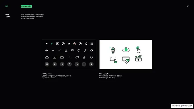
Two panels contrasting Hulu's Utility Icons grid with its more illustrative Pictographs.
Summary
An iconography overview page splitting the system into two categories, Utility Icons and Pictographs, shown as side-by-side panels.
Visual description
Near-black slide with the green "Iconography" tag top left and a bold white "Icon Types" label with a short note that Hulu iconography is organized into two categories. Two panels sit in the lower-middle. The left panel is dark and holds a dense grid of small white line utility icons (play, lightning, blocks, navigation, edit, settings, plus filled circular pause/play/arrow buttons in the bottom row, with one lightning icon picked out in green), captioned "Utility Icons: Use for navigation, notifications, and to represent actions." The right panel is white and holds six larger two-tone line pictographs (rocket, download cloud, tap gesture, devices, payment card, film clapper) with small green accents, captioned "Pictographs: Use when a Utility icon doesn't tell enough of a story."
Key takeaway
Splitting an icon system into a functional set and an expressive set and proving the distinction visually: tight monochrome utility glyphs on dark versus larger illustrative two-tone pictographs on light. The single green accent per group ties them to the brand.
Reuse notes
A clear template for documenting a two-tier icon system on one page. The dark-vs-light panel contrast reinforces the functional-vs-expressive split. Reusable for any product that maintains both UI glyphs and richer marketing icons.
From this deck: Hulu icon types
View deck














More like this
Keep what you find
A free account saves references to boards and can send you a weekly email of picks based on what you save.
To see every result, go Pro.