Preview image. Unlock full-res
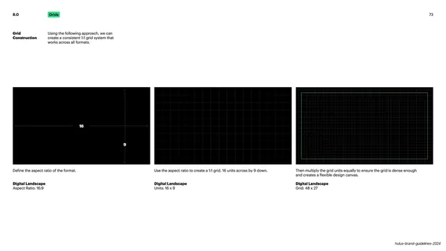
Light slide explaining the 1:1 grid construction in three black demo panels stepping from a 16:9 aspect ratio to a dense 48x27 unit grid.
Summary
A grid-system page that walks through building a consistent 1:1 grid in three steps, shown as three black demonstration panels on a white slide.
Visual description
White background with a tiny utility header: a bold "8.0" section number top-left, a small Hulu-green pill reading "Grids" beside it, and the page number "73" top-right. A two-column intro sits below: a bold "Grid Construction" label left, a short explanatory paragraph right. The lower half holds three equal black landscape panels in a row. The first shows a thin white plus-axis with "16" and "9" labels defining the aspect ratio. The second fills with a faint 16x9 unit grid. The third overlays a dense green-and-grey 48x27 multiplied grid inside a green safe-area rectangle. Each panel is captioned below in bold ("Digital Landscape") with its aspect ratio or grid spec. A "hulus-brand-guidelines-2024" running footer sits bottom-right.
Key takeaway
Teaching a grid as a three-step build (define ratio, divide into base units, multiply for density) instead of dumping a finished grid. Black demo panels on a white page make the grid lines read clearly without competing with the rest of the slide.
Reuse notes
A clean template for the grid or layout chapter of any brand or design-system guideline. The step-by-step panel sequence works for explaining any constructed system (spacing, type scale) where the logic matters as much as the result.
From this deck: Grid construction across formats
View deck








































More like this
Keep what you find
A free account saves references to boards and can send you a weekly email of picks based on what you save.
To see every result, go Pro.