Preview image. Unlock full-res
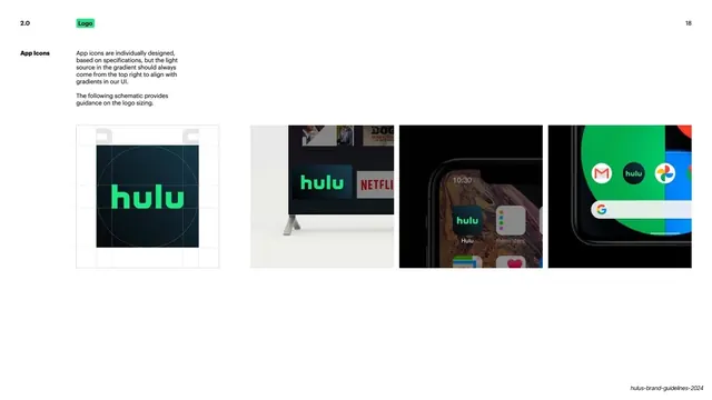
App-icon guidance: a construction grid for the dark gradient icon plus three real home-screen and TV examples, with a top-right light source note.
Summary
App-icon guidance: a construction schematic for the dark gradient Hulu icon (light source top-right), shown next to three real device examples.
Visual description
Near-black background. A bold white "App Icons" rail label sits beside a note: app icons are individually designed, the gradient light source should always come from the top-right to align with UI gradients, and a schematic gives sizing guidance. Left, a white-gridded construction square shows the dark green-to-black gradient icon with the green hulu wordmark and a circular sizing guide. To the right, three real examples: a connected-TV home row beside Netflix, an iOS home screen with the dark Hulu icon, and an Android home screen with the rounded green icon among Google apps. A page number sits top-right.
Key takeaway
Specifying the gradient's light-source direction (top-right) so the app icon stays consistent with the product's UI lighting. Backing the construction grid with real OS home-screen shots to prove the icon survives in context.
Reuse notes
A reusable app-icon spec page: construction grid plus light-source rule plus real platform examples. Strong for any product shipping native iOS/Android/TV icons. Needs genuine device captures for the examples.
From this deck: App icons construction and examples
View deck










More like this


Keep what you find
A free account saves references to boards and can send you a weekly email of picks based on what you save.
To see every result, go Pro.