Preview image. Unlock full-res
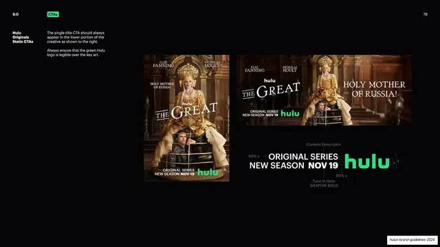
Dark slide showing the single-title CTA on poster and banner key art for "The Great", plus a measured spacing diagram of the lockup.
Summary
How the single-title CTA sits on real key art, demonstrated on a vertical poster and a horizontal banner for "The Great", with a measured spacing diagram of the lockup below.
Visual description
Near-black background. Header reads "9.0", a green "CTAs" pill, and "78" top-right. A bold white "Hulu Originals Static CTAs" label and short instructions sit at far left ("appear in the lower portion of the creative", "keep the green Hulu logo legible over key art"). Two examples fill the upper right: a vertical "The Great" poster (Elle Fanning in gold royal costume against an ornate interior) with the CTA "ORIGINAL SERIES NEW SEASON NOV 19 hulu" along the lower edge, and a horizontal banner crop of the same imagery with the CTA at lower-left. Below sits a spacing diagram of the lockup with grey measurement annotations: "Content Descriptor", "40% y", "80% x", clear-space brackets around the green "hulu" wordmark, and "Tune in date: GRAPHIK BOLD". A running footer sits bottom-right.
Key takeaway
Showing the same CTA lockup twice in real photographic key art (portrait and landscape) and then pulling it out into a measured spacing diagram on the same slide. The proportional spacing callouts (40% y, 80% x, clear-space brackets) tie the abstract rule to the live placement directly above.
Reuse notes
A reusable layout for any guideline that has to govern a logo or CTA placed over photography. The pattern of "two live examples plus one measured teardown" is directly transferable to badges, ratings, or sponsor lockups on imagery.
From this deck: Single-title CTA placement on key art
View deck