Preview image. Unlock full-res
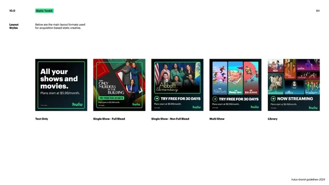
Light slide showing the five acquisition static-ad layout formats (Text Only, Single Show Full Bleed, Single Show Non Full Bleed, Multi Show, Library) as a row of green-outlined thumbnails.
Summary
The five main layout formats for acquisition-based static ads, laid out as a labeled row of example thumbnails.
Visual description
White background. A bold black "10.0" sits top-left with a green "Static Tookit" pill, and "84" top-right. A bold "Layout Styles" label and a one-line intro sit at far left. Across the lower-middle, five ad-creative thumbnails run in an even row, each captioned in bold beneath. "Text Only": a green-outlined black card reading "All your shows and movies. Plans start at $5.99/month." with the green "hulu" mark. "Single Show - Full Bleed": "Only Murders in the Building" key art with a "TRY FREE FOR 30 DAYS" button. "Single Show - Non Full Bleed": an "Abbott Elementary" cast image with a green border and CTA. "Multi Show": three vertical show panels with a 30-day-trial CTA. "Library": a grid of many show thumbnails under "NOW STREAMING". Every thumbnail carries pricing copy and the green wordmark. A running footer sits bottom-right.
Key takeaway
Presenting an ad system as a single labeled spectrum from least to most imagery (text-only through full library grid), so the family of layouts reads at a glance. Keeping the CTA and pricing constant across all five makes the differences purely about content density.
Reuse notes
A strong index slide for any performance or acquisition creative system with multiple template tiers. The left-to-right "amount of content" ordering is a clear mental model and pairs well with the per-format detail pages that follow.
From this deck: Static toolkit layout styles
View deck