Preview image. Unlock full-res
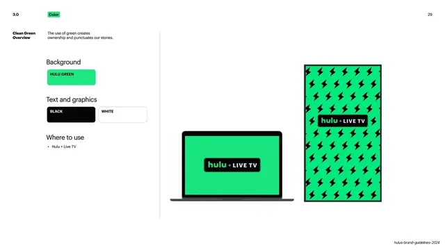
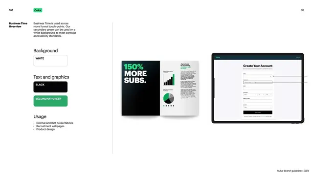
Split spec slide for the Business Time world, left rules column beside a printed report spread and a tablet account-creation mockup.
Summary
The Business Time rules page: a left column of white background and black/secondary-green text swatches plus a usage list, beside a "150% More Subs" report spread and a tablet account-creation screen.
Visual description
White ground split by a thin vertical rule. Top-left: "3.0" number and green "Color" pill; "30" top-right. Left column under "Business Time Overview" gives a short intro noting this world is for formal touch-points and that Secondary Green on white meets contrast standards; then "Background" with a White pill, "Text and graphics" with Black and Secondary Green pills, and a "Usage" list (Internal and B2B presentations, Recruitment webpages, Product design). The right two-thirds shows a printed report spread with a bold "150% More Subs" black panel and green bar and pie charts, and a tablet showing a clean white "Create Your Account" form. The mode reads as light, corporate and accessible.
Key takeaway
Defining a restrained corporate/B2B mode within the same system, explicitly justified by accessibility (secondary green for contrast on white). Same left-column rules template again, proving the framework holds for a quieter mode too.
Reuse notes
Reuse when a brand needs a sober internal/B2B variant alongside its expressive consumer modes. Calling out the accessibility reason for the secondary color is a good practice to copy. Pairs report and product-form examples to show formal contexts.
From this deck: Hulu Business Time color world overview
View deck