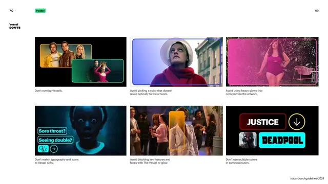
Preview image. Unlock full-res
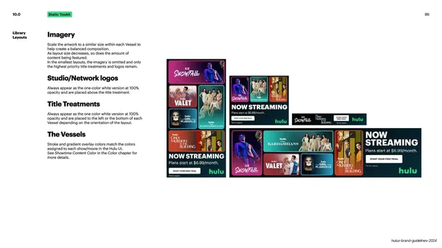
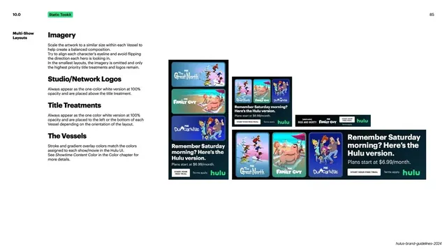
Light slide detailing the multi-show ad layout with rules for imagery, network logos, title treatments, and the "Vessel" panels, shown across four responsive sizes.
Summary
The detailed rules for multi-show ad layouts, covering imagery, network logos, title treatments, and the colored "Vessel" panels, illustrated at several sizes.
Visual description
White background. A bold black "10.0" sits top-left with a green "Static Tookit" pill, and "85" top-right. The left column is a stack of bold sub-headed rules: "Imagery" (scale artwork similarly within each Vessel, align eyelines, omit imagery at the smallest sizes), "Studio/Network Logos" (one-color white at 100% above the title), "Title Treatments" (one-color white at the side or bottom), and "The Vessels" (stroke and gradient overlay colors match the show's Hulu UI color). The right side shows the same "Remember Saturday morning? Here's the Hulu version." multi-show ad at four shrinking sizes, using FOX shows (The Great North, Family Guy, Duncanville, Rick and Morty) inside vertical rounded panels with colored gradient overlays, the green "hulu" mark, and a "START YOUR FREE TRIAL" CTA. A running footer sits bottom-right.
Key takeaway
Naming the colored content panels "Vessels" and tying their stroke and gradient colors back to each show's in-app color, so the ad stays linked to the product UI. Showing the same composition at four sizes and stating that imagery drops out at the smallest one is a precise responsive rule.
Reuse notes
A reusable detail page for any multi-item promotional layout that must hold several titles at once and survive down to tiny ad units. The "shared composition, fewer elements as it shrinks" approach is directly transferable to responsive banner systems.
From this deck: Multi-show layouts
View deck