Preview image. Unlock full-res
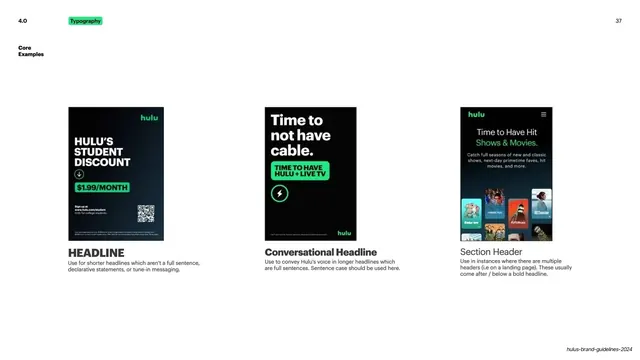
Typography spec page showing three Hulu ad mockups labeled Headline, Conversational Headline, and Section Header.
Summary
A typography guidance page that demonstrates three headline applications side by side using vertical Hulu ad mockups, each captioned with its use case.
Visual description
White slide with the small green "Typography" section tag and "4.0" top left, page number 37 top right, and a "Core Examples" label in bold black below. Three dark vertical ad mockups sit in a row across the lower-middle. The first shows "HULU'S STUDENT DISCOUNT" in white bold caps with a green "$1.99/MONTH" pill and a QR code, captioned "HEADLINE". The second reads "Time to not have cable." in mixed-case bold with a green "TIME TO HAVE HULU + LIVE TV" button, captioned "Conversational Headline". The third is a dark app screen with "Time to Have Hit Shows & Movies." over a grid of show thumbnails, captioned "Section Header". Each caption pairs a bold label with two lines of light gray explanatory copy.
Key takeaway
Demonstrating a type rule through three real-world ad comps rather than abstract specimens, so the difference between a short declarative headline, a full-sentence conversational tone, and a secondary section header reads at a glance.
Reuse notes
A clean template for a brand or design guideline page that shows the same type system across multiple ad formats. Works for any system that needs to differentiate headline registers. The vertical mockups carry the page, so prepare polished comps.
From this deck: Hulu typography core examples
View deck















More like this









Keep what you find
A free account saves references to boards and can send you a weekly email of picks based on what you save.
To see every result, go Pro.