Preview image. Unlock full-res
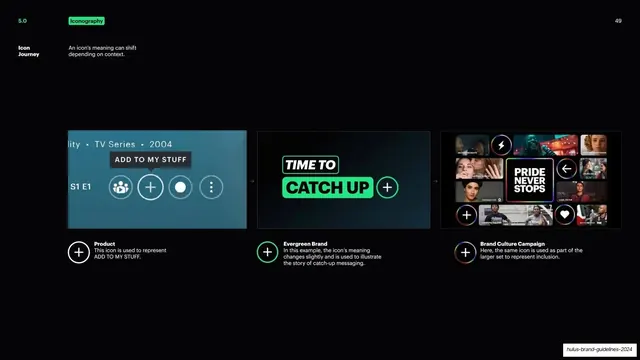
Three mockups showing the plus icon shifting meaning from product UI to evergreen brand to culture campaign.
Summary
A page tracing how one icon, the plus, shifts meaning across three contexts: product UI, evergreen brand, and a culture campaign.
Visual description
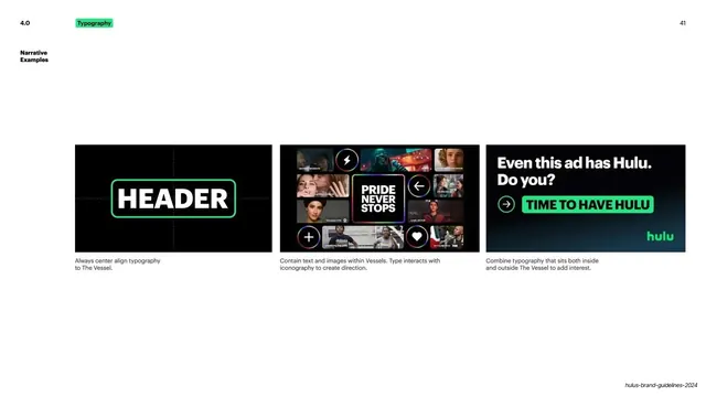
Near-black slide with the green "Iconography" tag top left and a bold white "Icon Journey" label noting an icon's meaning can shift depending on context. Three dark mockups run across the lower-middle, separated by small arrows. Left: a product UI bar over a streaming detail page with an "ADD TO MY STUFF" tooltip and a white plus button among other controls; below, a white-outlined plus captioned "Product: This icon is used to represent ADD TO MY STUFF." Center: a "TIME TO CATCH UP" ad with a green plus inside a Vessel; below, a green-outlined plus captioned "Evergreen Brand: the icon's meaning changes slightly and is used to illustrate the story of catch-up messaging." Right: a content grid surrounding a "PRIDE NEVER STOPS" Vessel with multicolor-ringed plus and heart icons; below, a rainbow-ringed plus captioned "Brand Culture Campaign: the same icon is used as part of the larger set to represent inclusion."
Key takeaway
Showing a single glyph's semantic range as a left-to-right journey (functional, brand, cultural) with arrows, proving that one icon can carry different meanings while staying recognizable. The treatment of the plus evolves (white, green, rainbow ring) to match each context.
Reuse notes
A compelling way to argue that icons are contextual, not fixed, useful in any system that reuses product glyphs in marketing. The three-step arrowed progression is reusable for showing escalation or evolution. Depends on having one icon that genuinely spans these contexts.
From this deck: Hulu icon journey
View deck























More like this





Keep what you find
A free account saves references to boards and can send you a weekly email of picks based on what you save.
To see every result, go Pro.