Preview image. Unlock full-res
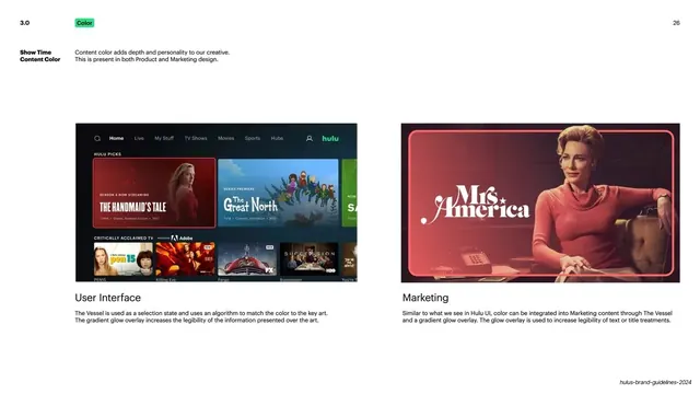
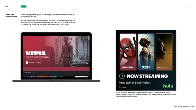
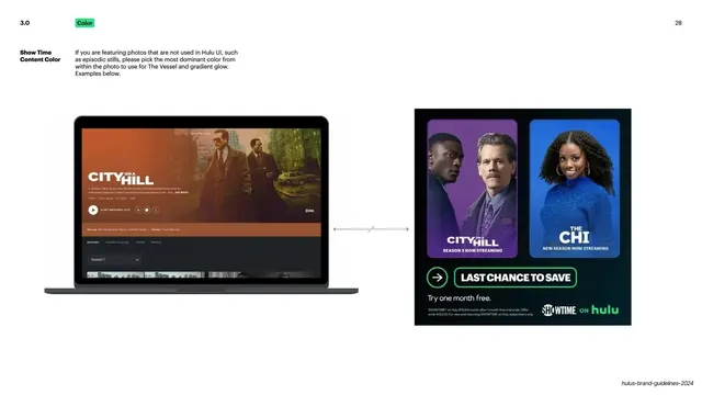
Light slide showing two captioned examples, a Hulu UI and a marketing still, of content color and gradient-glow treatment.
Summary
A two-up examples page contrasting how content color and a gradient glow are applied in Hulu's UI versus its marketing creative.
Visual description
White ground. Top-left: "3.0" number and green "Color" pill; "26" top-right. A left label "Show Time Content Color" with a one-line intro. Two large captioned panels sit side by side: the left is a Hulu app home screen ("The Handmaid's Tale," "The Great North," a "Critically Acclaimed TV" row) captioned "User Interface" with a paragraph explaining The Vessel selection state and gradient-glow overlay; the right is a warm red-toned "Mrs. America" key-art frame captioned "Marketing" with a paragraph on integrating color via The Vessel and glow. Each example has its caption and body set beneath it in a tidy column.
Key takeaway
Teaching a single mechanic (color sampled from key art into a glowing "vessel") by showing it once in product and once in marketing, side by side, so the rule transfers across surfaces. The captioned-pair layout is clean and didactic.
Reuse notes
Reuse when a brand rule must hold across both UI and campaign work. Two real examples with explanatory captions beat an abstract description. Requires strong source key art with a clear dominant color.
From this deck: Hulu Show Time content color examples
View deck































More like this







Keep what you find
A free account saves references to boards and can send you a weekly email of picks based on what you save.
To see every result, go Pro.