Preview image. Unlock full-res
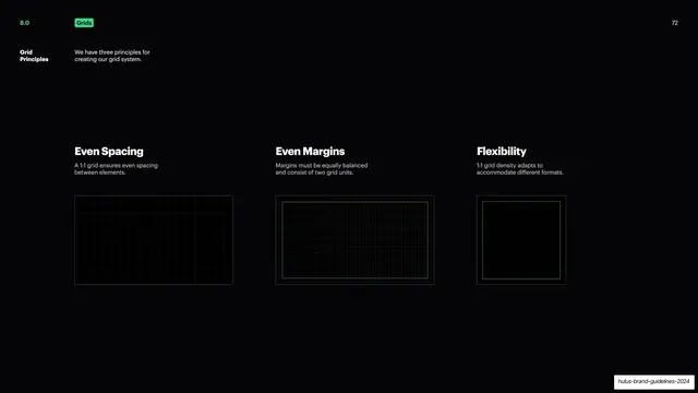
Three-column page stating the grid principles, each with a short rule and a faint grid-overlay diagram.
Summary
A grid-principles page presenting three rules in parallel columns, each with a short statement and a faint grid diagram showing the idea.
Visual description
Black background, green "8.0" / "Grids" pill header, white "72" top-right, and a "Grid Principles" sidebar label with a short note. Three columns sit in the lower half, each with a white headline, a gray two-line description, and a dark panel showing a subtle gray grid: "Even Spacing" (a 1:1 grid for even spacing between elements), "Even Margins" (margins balanced as two grid units, shown with a green inset boundary), and "Flexibility" (1:1 grid density adapting to formats, shown as a smaller square grid). The top half is empty.
Key takeaway
Stating a system's core principles as three short, parallel rules, each paired with a quiet grid thumbnail that shows rather than tells. Anchoring the trio to the lower half leaves calm space above, matching the other framework pages.
Reuse notes
A clean overview page for the principles behind a grid or layout system, before the detailed specs. The three-column headline-note-diagram pattern is consistent with the rest of the deck and easy to extend. Keep the diagrams subtle so the rules lead.
From this deck: Grid principles, three rules
View deck