Preview image. Unlock full-res
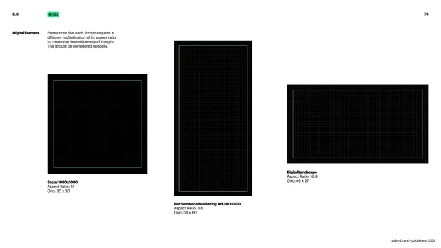
Light slide showing the grid adapted to three digital formats (square 1:1, vertical 3:6 ad, and 16:9 landscape) as black panels with green safe-area grids.
Summary
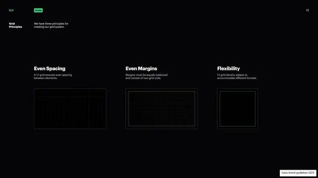
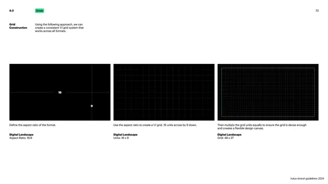
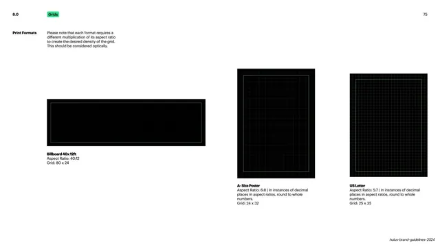
The grid system applied across three digital output formats, each shown as a black panel with a green safe-area grid and its own multiplication.
Visual description
White background with the same header treatment: bold "Digital formats" label top-left, a green "Grids" pill, an intro paragraph noting each format needs a different grid multiplication, and "74" top-right. Three black demonstration panels are staggered at different heights across the slide rather than aligned in a row. Left, a square panel labeled "Social 1080x1080" (Aspect Ratio 1:1, Grid 30x30). Center, a tall vertical panel labeled "Performance Marketing Ad 300x600" (Aspect Ratio 3:6, Grid 30x60). Right, a wide landscape panel labeled "Digital Landscape" (Aspect Ratio 16:9, Grid 48x27). Each panel carries a faint green dense grid inside a lighter green safe-area rectangle. Bold format names with grey spec lines caption each, and a running footer sits bottom-right.
Key takeaway
Staggering the format panels at different vertical positions so a square, a tall vertical, and a wide landscape can share one slide without looking cramped or forcing a rigid baseline. Repeating the safe-area-inside-grid motif makes the system feel consistent across very different shapes.
Reuse notes
Useful for any guideline that has to show one grid logic surviving across social, ad, and web formats. The mixed-orientation layout is a good answer to the recurring problem of displaying portrait and landscape artboards together.
From this deck: Grid across digital formats
View deck















More like this
Keep what you find
A free account saves references to boards and can send you a weekly email of picks based on what you save.
To see every result, go Pro.