Preview image. Unlock full-res
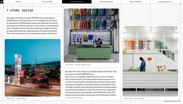
Retail-design page mixing three photographs of FREITAG stores with two short body-copy columns, set on the same gridded report template.
Summary
A store-design page: three photographs of FREITAG retail spaces (a night skyline of stacked shipping containers, a green-and-yellow shelving interior, and a bright shop floor) are arranged with two columns of body copy across a gridded report layout.
Visual description
The six-tab header (CIRCULAR PRODUCTS active) tops the page on a hairline. A monospace "F-STORE DESIGN" headline and a paragraph open the upper-left, with a second body column at center-right. Three photos are placed across the page: a small portrait night shot of an illuminated container-tower store at lower-left, a larger landscape interior of green modular shelving hung with colourful bags at upper-center, and a tall interior of a person at a service counter in a sunlit store at right. Each photo carries a small monospace credit. Hairline rules separate the zones; numbered ticks edge the bottom.
Key takeaway
Treating a page like a controlled photo collage: three images at different sizes and crops, slotted into the same grid as the text, so a retail story feels rich but still orderly. The varied photo scales create rhythm while the monospace credits and hairlines keep everything anchored to the report's system.
Reuse notes
A good model for spatial, retail, or environment pages in a report, or for an interiors or architecture case study. Works whenever you have three or more images of one subject and want them to read as a set rather than a gallery. Keep crops and credit styling consistent; let the photos sit on the same grid as the body text so the page stays disciplined.
From this deck: F-store design three-photo retail interiors page
View deck
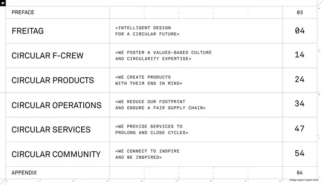
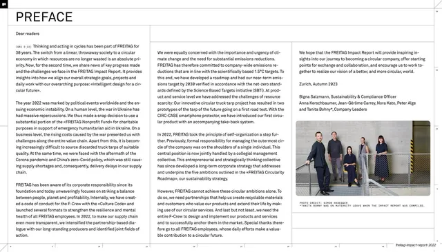
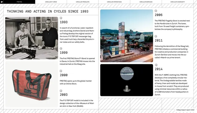















More like this



Keep what you find
A free account saves references to boards and can send you a weekly email of picks based on what you save.
To see every result, go Pro.