Preview image. Unlock full-res
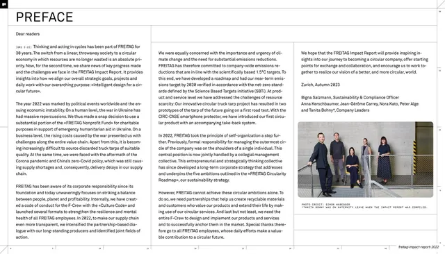
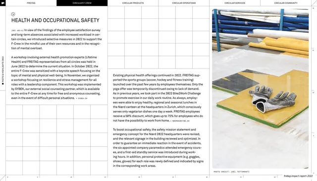
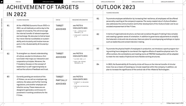
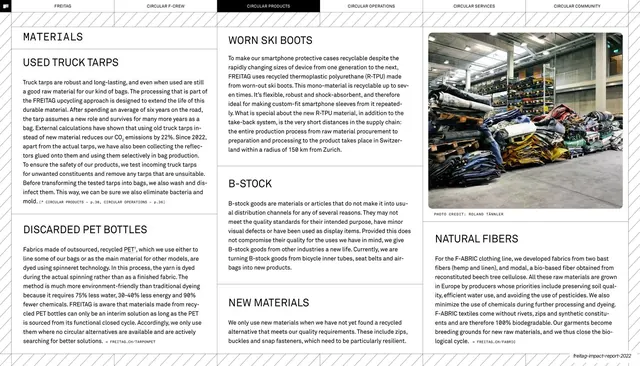
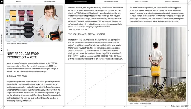
A dense four-column "Dear readers" preface letter with a small photo of company leaders in the lower right.
Summary
The preface: a "Dear readers" letter set across four tight text columns with a small leadership photograph tucked into the lower-right column.
Visual description
White page headed by a large "PREFACE" title under a hairline rule. The body is a long letter beginning "Dear readers", set in a small humanist sans and flowing across four narrow columns with a small monospace reference tag "[GRI 2-22]" inline at the start. The text closes with a sign-off ("Zurich, Autumn 2023") and named signatories. A small colour photograph of several people seated in an industrial space sits in the bottom-right column with a tiny monospace photo credit beneath it. Faint ruler ticks run along the right and bottom edges.
Key takeaway
Treating an executive letter as a four-column editorial article rather than a centred block, so a wall of text still feels designed and paced. The inline monospace GRI reference tags signal an audited, standards-based document without interrupting the read.
Reuse notes
Good for the foreword or letter-from-leadership page of any annual or sustainability report that carries a lot of copy. The four-column grid demands genuinely substantial text; a short note would float. Keep the single small photo as the only relief.
From this deck: Preface letter spread
View deck













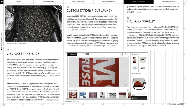
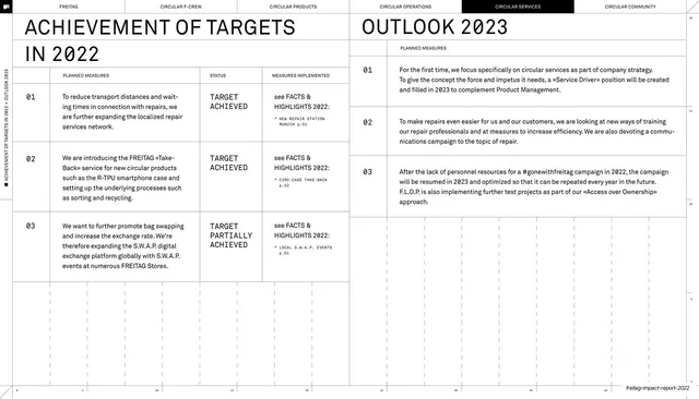


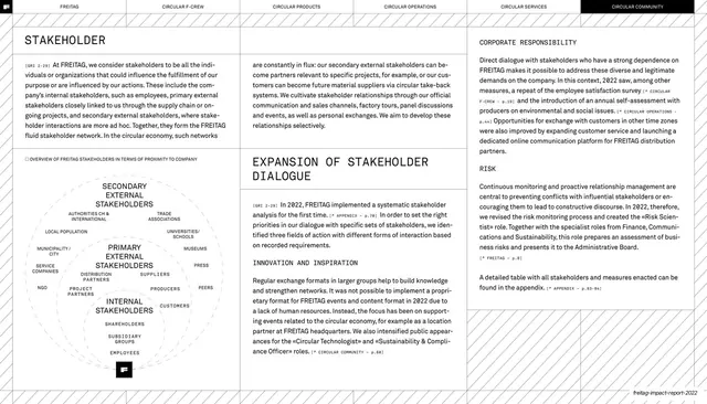
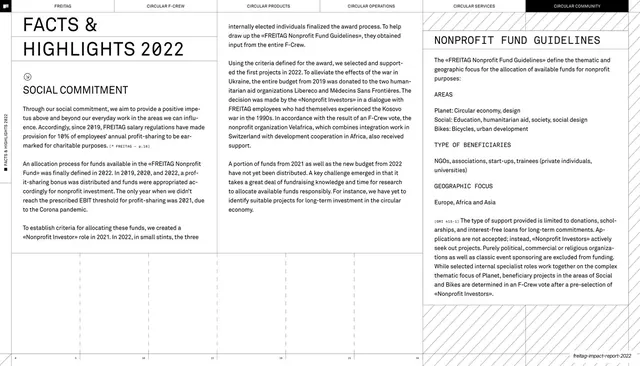




More like this







Keep what you find
A free account saves references to boards and can send you a weekly email of picks based on what you save.
To see every result, go Pro.