Preview image. Unlock full-res
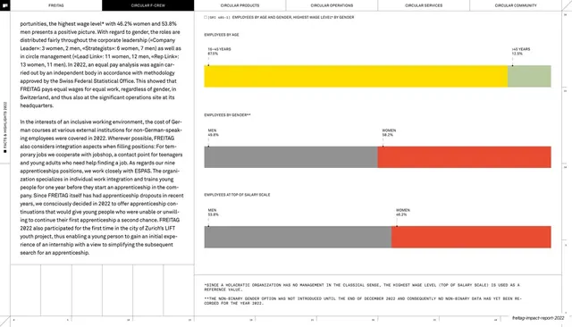
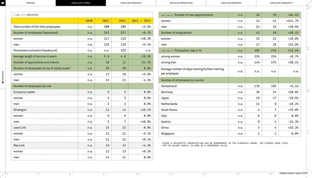
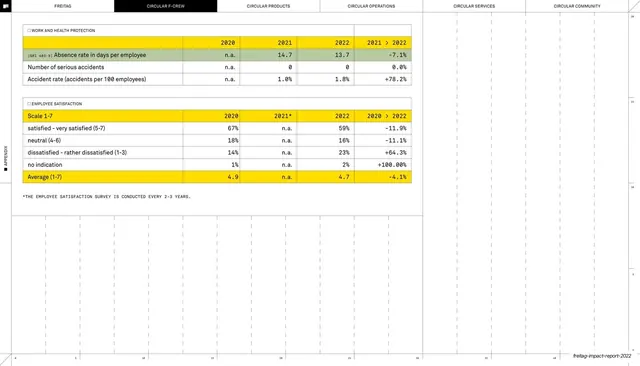
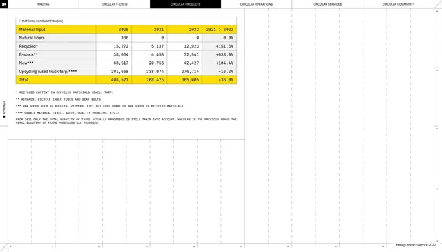
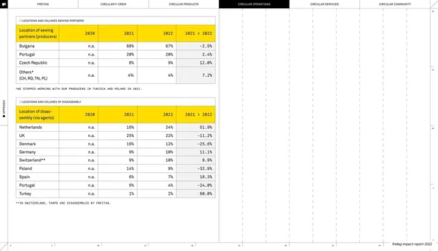
Report page placing a left column of body copy beside three full-width horizontal stacked bars showing employee splits by age, gender and salary level.
Summary
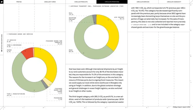
A workforce-demographics page: two columns of body copy on the left, and on the right three stacked full-width horizontal bars splitting employees by age (yellow vs green), gender (grey vs red) and top-of-salary-scale (grey vs red), each labelled with paired percentages.
Visual description
The recurring six-tab header runs across the top (CIRCULAR F-CREW active) on a hairline, with the rotated "FACTS & HIGHLIGHTS 2022" label in the margin. The left half is two columns of small justified serif body text. The right half stacks three labelled charts, each a single wide horizontal bar divided into two segments: "EMPLOYEES BY AGE" (signal-yellow vs grey-green), "EMPLOYEES BY GENDER" (grey vs red), "EMPLOYEES AT TOP OF SALARY SCALE" (grey vs red). Each segment carries a small monospace category and percentage at its top edge with a thin tick. Two asterisked monospace footnotes close the bottom-right under a rule.
Key takeaway
Reducing each demographic to a single two-segment bar and stacking three of them in a tidy column, so a whole HR dataset reads in seconds with almost no chart furniture. Labels sit above the bars on hairline ticks rather than inside, keeping the bars clean.
Reuse notes
Ideal for the diversity, pay-equity or workforce sections of a sustainability or annual report where simple part-to-whole splits beat elaborate charts. The two-segment bar pattern is reusable for any binary or two-category comparison. Hold to two or three colors so the signal yellow and red stay meaningful.
From this deck: Employees by age and gender stacked bars
View deck






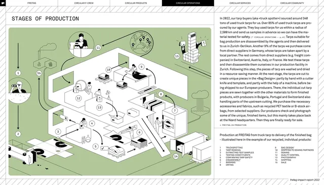
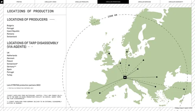
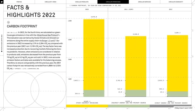
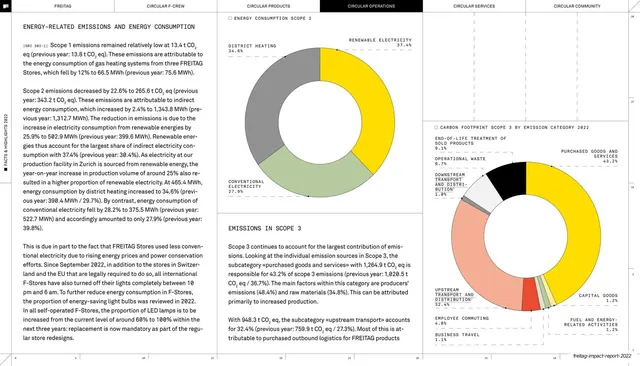







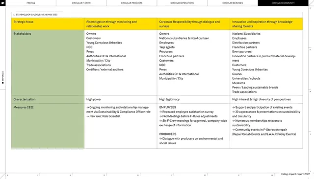
More like this






Keep what you find
A free account saves references to boards and can send you a weekly email of picks based on what you save.
To see every result, go Pro.