Preview image. Unlock full-res
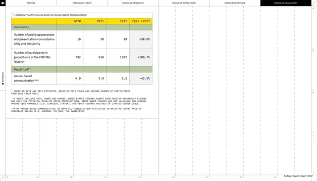
Circular Community appendix table reporting public appearances, factory-tour participants and values-based communication reach from 2020 to 2022.
Summary
A Circular Community appendix page with one table covering public appearances, guided factory-tour participants and the reach of values-based communication across 2020 to 2022.
Visual description
White ground, faint dotted grid, right-edge ruler, rotated "APPENDIX" tab; the six-tab header shows CIRCULAR COMMUNITY in a black pill. A single "COMMUNITY ACTIVITIES AND REACH OF VALUES-BASED COMMUNICATION" table sits at left. A green "Community" banner row leads two tall metric rows (number of public appearances and presentations; number of participants in guided FREITAG factory tours), then a green "Reach [bn]" banner with a values-based communication row. Columns are 2020, 2021, 2022 and a "2021 > 2022" percent delta in monospace numerals, the change column shaded light grey. Three long asterisked footnotes explain estimation and reach methodology; the lower-right page is empty grid. The running footer carries the deck slug.
Key takeaway
Letting row height breathe for metrics whose labels wrap to several lines, rather than cramming them, so a sparse table still feels intentional. The grey-shaded delta column quietly separates change from the raw years, and long methodology footnotes keep caveats off the data rows.
Reuse notes
Good for outreach, marketing-reach, or community-engagement metrics where each line needs a wordy label and a caveat. The tall-row, heavily-footnoted treatment suits soft metrics that need explanation. Keep consistent with the deck's other appendix tables via the tab header, green banners and dotted grid.
From this deck: Community activities and reach table
View deck