Preview image. Unlock full-res
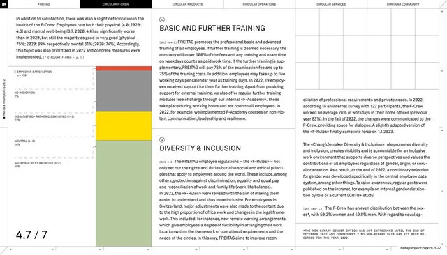
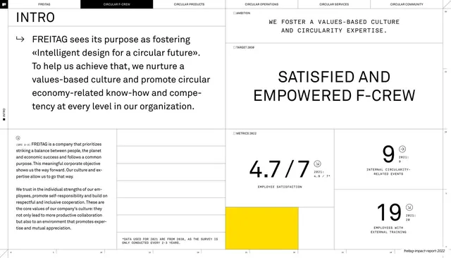
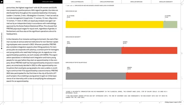
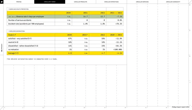
Multi-column report page on training and diversity, anchored by a small stacked satisfaction bar chart and an oversized 4.7/7 score in the bottom-left corner.
Summary
A dense report page covering basic training, further training and diversity and inclusion across several text columns, with a small color-coded stacked satisfaction bar at top-left and an oversized "4.7 / 7" score parked in the bottom-left corner.
Visual description
The same six-tab section header (CIRCULAR F-CREW active) and rotated left-margin label sit on hairline rules. The body is broken into multiple narrow justified columns with all-caps serif subheads ("BASIC AND FURTHER TRAINING", "DIVERSITY & INCLUSION") and monospace inline references. Upper-left, a compact horizontal stacked bar legend ("EMPLOYEE SATISFACTION") uses signal yellow, red, grey-green and grey segments labelled by percentage. The lower-left quadrant is left mostly empty except for a very large serif "4.7 / 7" acting as the headline metric. Numbered tick marks rule the bottom edge.
Key takeaway
Pulling one summary number out at display size and isolating it in whitespace, so a page otherwise packed with text still has a single thing the eye lands on. The tiny color-keyed stacked bar shows how to embed a chart without breaking the column grid.
Reuse notes
Good for the people, HR, or culture sections of an impact or annual report where you need to show survey results without a full dashboard. The oversized pull-stat is reusable anywhere a page needs a focal point. Works best on a light, gridded layout; the signal-yellow accent does the lifting, so keep the rest restrained.
From this deck: Training and inclusion with stacked bar and big stat
View deck












More like this






Keep what you find
A free account saves references to boards and can send you a weekly email of picks based on what you save.
To see every result, go Pro.