Preview image. Unlock full-res
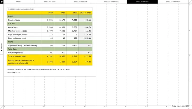
Circular Services appendix table grouping repair, S.W.A.P., loan and take-back service usage by year, with a green-banded structure and yellow totals.
Summary
A Circular Services appendix page with one table comparing service usage (repair, S.W.A.P. exchange, loans, take-back) year over year, organised by green-banded service category.
Visual description
White ground, faint dotted grid, right-edge ruler, rotated "APPENDIX" tab; the six-tab header shows CIRCULAR SERVICES in a black pill. A single "USED SERVICES IN ANNUAL COMPARISON" table fills the left half: green banner rows label each service group (Repair, S.W.A.P., Loans, Take-Back) with indented metric rows beneath (repaired bags, active bags, matches between bags, bags exchanged online/event, returned products) across 2020, 2021, 2022 and a "2021 > 2022" delta in monospace numerals. Two yellow rows close the table: a Total of services used and a yellow ratio row, "Product-related services used in relation to products sold". Two asterisked footnotes follow; the lower-right page is empty grid. The running footer carries the deck slug.
Key takeaway
Using green category banners as headers and indenting the metric rows beneath them, so a service portfolio reads as grouped sub-totals rather than a flat list. Ending on two yellow summary rows (an absolute total and a derived ratio) cleanly separates raw counts from the headline KPI.
Reuse notes
A clean template for usage or engagement metrics that fall into named programs or service lines. The banner-plus-indent grouping is reusable for any data with categories and sub-items, and the derived-ratio yellow row is a tidy way to surface one summary metric. Keep the active-tab header and dotted grid for consistency with the appendix.
From this deck: Used services annual comparison table
View deck