Preview image. Unlock full-res
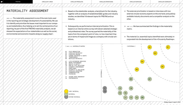
A materiality assessment spread with an explanatory column and a large two-axis materiality matrix plotting numbered topics as yellow, green, and grey dots.
Summary
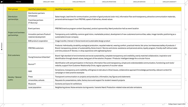
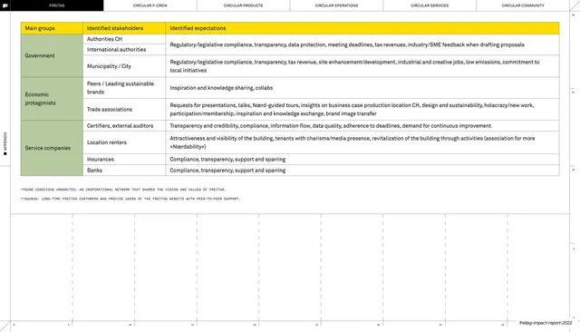
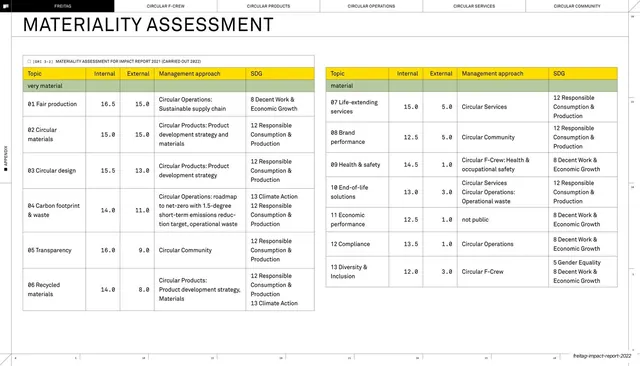
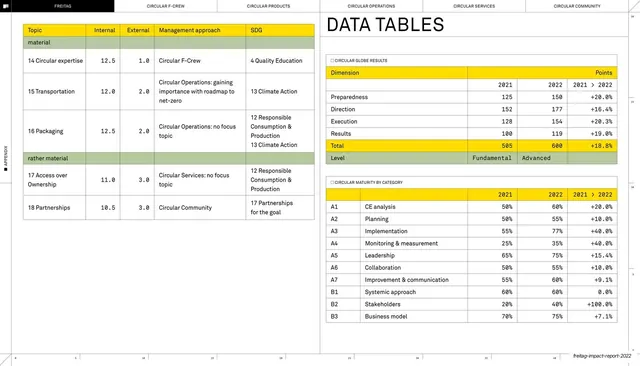
The materiality assessment: an explanatory left column and a large two-axis matrix (internal versus external relevance) plotting eighteen numbered ESG topics as colour-coded dots.
Visual description
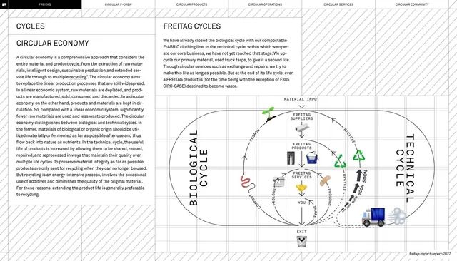
White spread headed "MATERIALITY ASSESSMENT" on the left over a diagonal-hatch panel, with arrow-bulleted method notes in the centre carrying inline GRI tags. The right half is a scatter-style matrix: dashed concentric arcs sweep from the lower-left origin, axes labelled "[INTERNAL]" and "[EXTERNAL]", and eighteen small circular markers numbered 01 to 18 plotted across it. The markers are coloured yellow ("very material"), sage green ("material"), and grey ("rather material"), with a numbered topic key and a small legend at the lower left. Hairline rules and a faint ruler scale frame the spread.
Key takeaway
Encoding a standard ESG materiality matrix in the brand's own three-tone palette (yellow, green, grey) so it doubles as a brand asset, and numbering the dots against a compact key instead of labelling each point. The dashed concentric arcs give the plot a visual "heat" gradient toward the high-priority corner.
Reuse notes
Directly reusable for the materiality or double-materiality page that most sustainability reports now require. The numbered-key approach keeps a crowded plot readable. Reads best when the three priority tiers map onto the brand's existing accent colours.
From this deck: Materiality assessment matrix
View deck





















More like this








Keep what you find
A free account saves references to boards and can send you a weekly email of picks based on what you save.
To see every result, go Pro.