Preview image. Unlock full-res
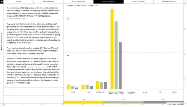
Text-left, chart-right spread with a multi-category grouped bar chart of operating and production waste by material across three years.
Summary
A waste-data spread: several justified text columns on the left and a wide grouped bar chart on the right plotting operating and production waste by material category (metal, wood, cardboard, general waste, and more) across 2020-2022.
Visual description
The six-tab header runs along the top with CIRCULAR OPERATIONS inverted. The left and centre carry three columns of small justified body text with monospace cross-references. The right two-thirds is a wide chart titled "OPERATING AND PRODUCTION WASTE [T]" on a hairline baseline grid: clusters of three slim bars (yellow 2020, green 2021, grey 2022) for each material category along the x-axis, with one dramatically tall "GENERAL OPERATIONAL WASTE INCL. TARP" cluster dwarfing the rest. A three-segment year legend (yellow, green, grey) runs along the bottom above a faint numeric ruler. The deck-slug footer sits bottom-right.
Key takeaway
The consistent three-color year coding (yellow/green/grey) reused across every chart in the deck, so readers learn the legend once. Letting one outlier cluster tower over the others communicates scale instantly without annotation.
Reuse notes
Good for comparing many categories across a few time periods in one view. The big-outlier effect only works when the data genuinely has one; otherwise the small bars become unreadable. Pair with body text that explains the spike, as done here.
From this deck: Operating and production waste bar chart
View deck











More like this







Keep what you find
A free account saves references to boards and can send you a weekly email of picks based on what you save.
To see every result, go Pro.