Preview image. Unlock full-res
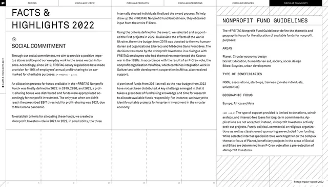
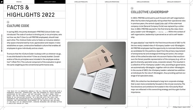
Three-column report page led by a large outline headline, mixing social-commitment body copy with a boxed Nonprofit Fund Guidelines panel.
Summary
A three-column interior page anchored by a large outline-weight headline and a structured Nonprofit Fund Guidelines block. It pairs free-flowing narrative copy with a labeled, almost form-like reference panel.
Visual description
White page, six-chapter top nav with "CIRCULAR COMMUNITY" filled black. The top-left sets a large lightweight "FACTS & HIGHLIGHTS 2022" headline (the type reads as an outline or hairline cut) over a smaller all-caps "SOCIAL COMMITMENT" subhead and several justified paragraphs with a monospace citation tag and a small icon. The middle column is continuous body copy about the Nonprofit Fund. The right column is a structured reference block headed "NONPROFIT FUND GUIDELINES" with all-caps sub-labels stacked down it (AREAS, TYPE OF BENEFICIARIES, GEOGRAPHIC FOCUS), each followed by short entries, then a closing paragraph. Thin vertical rules divide the columns, a vertical spine label runs up the left edge, and the running footer sits at the bottom right.
Key takeaway
Setting a big airy outline headline against tiny dense body copy for instant hierarchy. The right-hand guidelines block, with stacked all-caps category labels over short answers, is a clean way to make a definition or spec list feel ordered without a table.
Reuse notes
Useful for report or policy pages that mix storytelling with a structured fact panel side by side. The labeled-block pattern transfers to FAQ, criteria, or spec sections. Keep the headline weight light so it reads as a section marker rather than competing with the body.
From this deck: Facts & highlights 2022, Nonprofit Fund Guidelines
View deck












More like this






Keep what you find
A free account saves references to boards and can send you a weekly email of picks based on what you save.
To see every result, go Pro.