Preview image. Unlock full-res
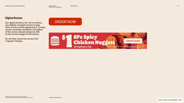
Cream page specifying the rounded ORDER NOW digital button, shown as a red button swatch above a real promo banner ad mockup.
Summary
A digital-button specification page: a large red "ORDER NOW" button swatch sits above a real promotional web-banner mockup, with a left column explaining the slightly-rounded corner rule and a "do not fully round into capsule shapes" caveat.
Visual description
Warm cream background with the running header and page "117." The left column has a bold brown "Digital Button" heading and two serif paragraphs: the first explains using slightly rounded corners for a tactile CTA and keeping the radius at 25 percent of the button's vertical height, the second is a "Do not fully round the corners into 'capsule' shapes" warning. The right side stacks two elements: a large red rectangular "ORDER NOW" button with gently rounded corners and pale text, and below it a horizontal promo banner mockup (red field, the bun logo, a "$1 8Pc Spicy Chicken Nuggets, $0 Delivery Fee" offer, fried product photography, and an "ORDER NOW" pill) demonstrating the button in a live ad. A small "Image for inspiration only" note and legal line run along the footer.
Key takeaway
Pairing an isolated component swatch with a real-world mockup on the same page, so the abstract spec (corner radius rule) and the applied result (the banner ad) are read together. Stating the radius as a percentage of height rather than a fixed pixel value makes the rule scale across button sizes, and the explicit "no capsule shapes" caveat heads off the most common misuse.
Reuse notes
A useful pattern for any component-spec page: define the rule, show the bare component, then show it deployed in context. The percentage-based radius and the negative example ("do not do this") are both worth copying. The banner is labeled inspiration-only, so treat the live ad as illustrative rather than a locked layout.
From this deck: Digital button spec with banner mockup
View deck





More like this

Keep what you find
A free account saves references to boards and can send you a weekly email of picks based on what you save.
To see every result, go Pro.