Preview image. Unlock full-res
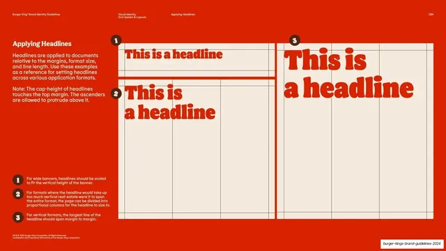
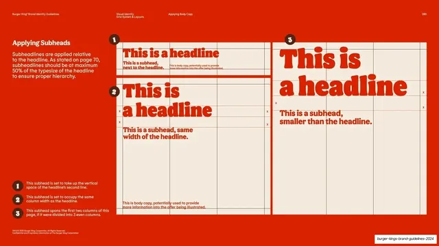
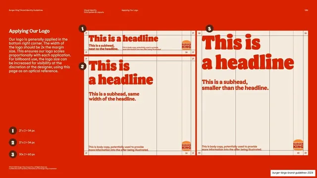
Red slide showing how headlines scale to fit three application formats over visible column grids, with numbered notes.
Summary
A layout-rules page demonstrating how red headlines are sized to three formats (wide banner, multi-column page, tall vertical) over visible cream grids, keyed to numbered notes.
Visual description
Full-bleed BK red (#E5392A), standard utility header. The left column carries a brown "Applying Headlines" heading and two short paragraphs, one noting that cap-height touches the top margin while ascenders may protrude. The right shows three cream frames with faint column gridlines: a short wide banner (1) with a single-line red headline, a square-ish frame (2) split into proportional columns with a two-line red headline, and a tall vertical frame (3) with a large two-line red headline spanning margin to margin. Each frame placeholder reads "This is a headline" in the red rounded display face. Brown numbered badges sit on each frame and repeat as a legend down the lower-left.
Key takeaway
Showing the same placeholder headline resized to fit three very different formats over their actual grids, so the rule (scale the headline to the format, not a fixed point size) is demonstrated rather than described. The grid stays visible so the relationship to columns reads.
Reuse notes
A reusable model for documenting responsive or multi-format type behavior. Keep one dummy phrase across all frames and expose the grid so readers see how headlines lock to columns and margins. Pairs with the subhead and body-copy pages that follow it.
From this deck: Applying headlines to formats
View deck











































More like this




Keep what you find
A free account saves references to boards and can send you a weekly email of picks based on what you save.
To see every result, go Pro.