Preview image. Unlock full-res
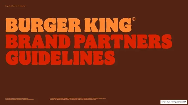
Brown cover with an oversized two-tone wordmark reading BURGER KING BRAND PARTNERS GUIDELINES in the brand's rounded retro display face.
Summary
The title slide: a deep BBQ-brown field carrying a huge, three-line, all-caps wordmark that fills the upper half, with "BURGER KING" in flame orange and "BRAND PARTNERS GUIDELINES" in fiery red.
Visual description
Full-bleed brown background. A small flame-orange label sits top-left ("Burger King Brand Identity Guidelines"). The dominant element is an oversized rounded retro display lockup stacked on three lines: "BURGER KING" with a registered mark in warm orange, then "BRAND PARTNERS" and "GUIDELINES" in fiery red, all caps, tightly set and bleeding nearly edge to edge. A two-line legal credit runs bottom-left and a short confidentiality disclaimer sits bottom-center, both small.
Key takeaway
Letting one oversized typographic lockup, split into two warm tones, carry the entire cover with no imagery at all. The all-caps rounded face does the branding work, while a tiny utility label and legal lines keep it feeling like an official document.
Reuse notes
A confident cover pattern for brand books and internal guideline decks where the type itself is the identity. Depends on a distinctive display cut and a tight two-color split; would fall flat in a generic typeface. The brown-with-warm-type combination reads premium and on-brand for food.
From this deck: Burger King Brand Partners Guidelines cover
View deck