Preview image. Unlock full-res
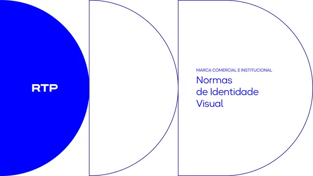
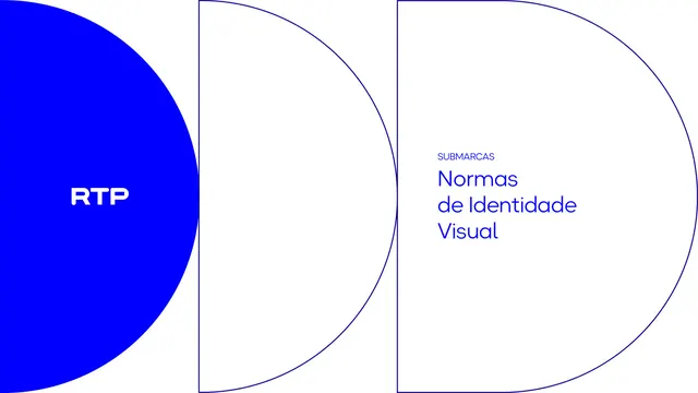
Electric-blue section divider introducing the master-brand chapter, with the RTP mark and section title over tiled half-circle outlines.
Summary
The opening divider for the master-brand chapter ("Marca Comercial e Institucional"), set as a full electric-blue page with the half-circle motif and a section title.
Visual description
A full electric-blue spread. The brand's half-circle / "D" outline geometry is built from thin navy arcs and vertical rules, with the right-hand arc filling into a slightly darker blue. The white "RTP" mark sits centered-left inside one arc; the section title "MARCA COMERCIAL E INSTITUCIONAL" is set in two lines of white Okta Neue on the right.
Key takeaway
A repeatable divider system: the same outlined-arc construction reappears at every chapter open, so section breaks are recognizable as a set. Placing the small logo inside the geometry ties the mark to the motif.
Reuse notes
A clean chapter-opener pattern for any multi-section manual. Reach for it to signal a new part of a document while staying inside one color world. The arc motif is specific to RTP, but the principle (one reusable divider built from the brand's own shapes) transfers.
From this deck: Section divider, Marca Comercial e Institucional
View deck