Preview image. Unlock full-res
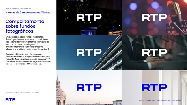
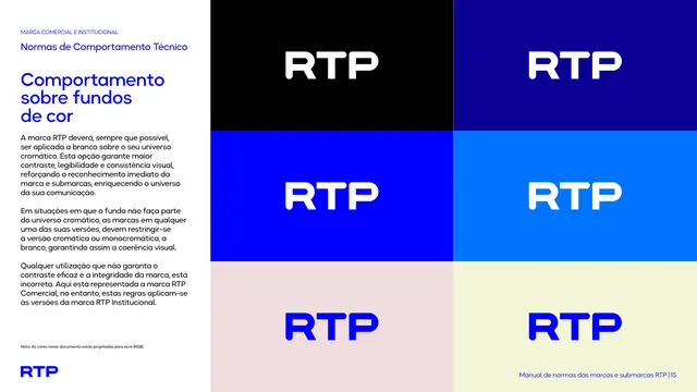
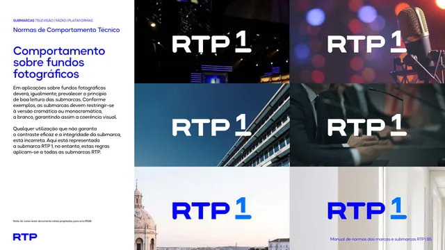
Six-photo grid showing the RTP mark reversed white over dark images and in blue over light images, demonstrating legibility over photography.
Summary
The rule for placing the mark over photography ("Comportamento sobre fundos fotográficos"), shown as a grid of photos each carrying the RTP wordmark in white or blue depending on the image value.
Visual description
The left white column carries the head and black paragraphs on maintaining legibility over images, restricting sub-brands to the chromatic or white monochrome version. The right two-thirds is a six-photo grid: darker images (a lit TV studio, a studio microphone, a blue building, a press conference) carry the white wordmark; lighter images (a domed Lisbon landmark, a pale interior) carry the blue wordmark. Footer right "Manual de normas das marcas e submarcas RTP | 16".
Key takeaway
Demonstrating the contrast rule on real photography, not flat swatches, proves the mark survives over busy imagery. Mixing dark and light photos in one grid shows both reversed and positive behavior in context.
Reuse notes
Reach for this when a brand lives over photography (broadcasters, media, lifestyle) and needs to prove the logo reads on real backgrounds. Pair it with the flat-color version for a complete "logo on backgrounds" pair.
From this deck: Behavior on photographic backgrounds
View deck





















More like this







Keep what you find
A free account saves references to boards and can send you a weekly email of picks based on what you save.
To see every result, go Pro.