Preview image. Unlock full-res
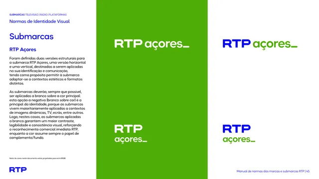
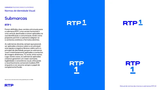
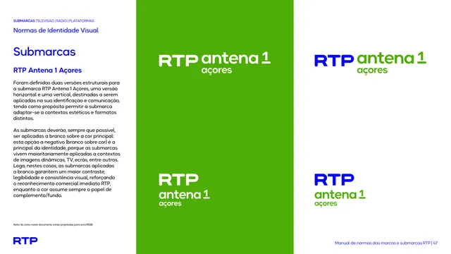
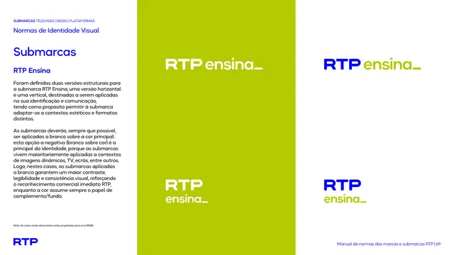
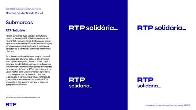
Sub-brand spec page showing the RTP Açores lockup in horizontal and vertical, white-on-green and full-color variants.
Summary
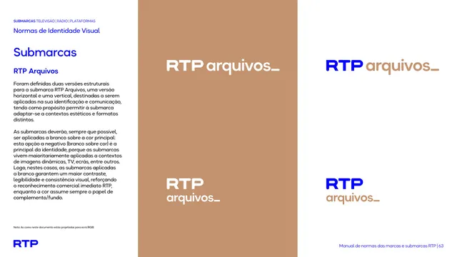
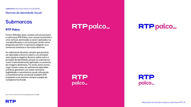
A sub-brand construction page for RTP Açores, presenting the lockup in horizontal and vertical arrangements across a white-on-green negative version and a two-color positive version.
Visual description
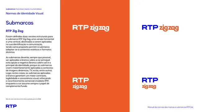
Left third is a white text column: kicker "SUBMARCAS TELEVISÃO | RÁDIO | PLATAFORMAS", "Normas de Identidade Visual", a large blue "Submarcas" heading, the sub-brand name "RTP Açores", and two paragraphs of Portuguese body copy explaining that two structural versions exist and that sub-brands should be applied in white over the primary color. The right two-thirds is split: a tall green panel holds the white RTP Açores lockup (horizontal top, stacked vertical bottom), and a white panel beside it repeats both arrangements in full color (blue "RTP" plus green "açores_"). A small "Nota" line and blue RTP logo sit bottom-left; running footer bottom-right.
Key takeaway
The disciplined three-up presentation: one negative lockup on the brand color next to the same lockup in positive color, in both horizontal and vertical forms, makes the whole behavior legible at a glance. The trailing underscore glyph on "açores_" is a consistent brand-voice device across every sub-brand.
Reuse notes
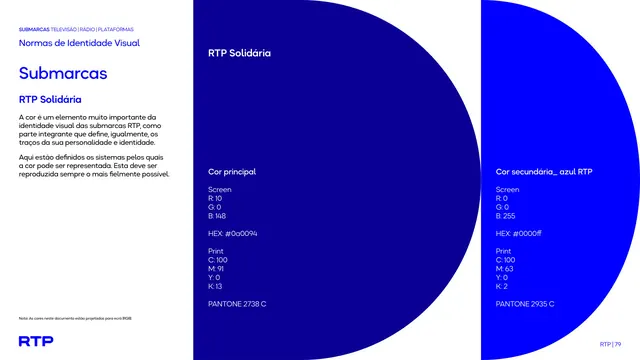
A clean template for documenting a sub-brand or product lockup that has multiple orientations and color treatments. Pairs with the matching color-spec page that follows. The left-rail intro copy is reused verbatim across every sub-brand in this deck, so it reads as a repeatable layout grammar.
From this deck: RTP Açores sub-brand lockup construction
View deck









More like this







Keep what you find
A free account saves references to boards and can send you a weekly email of picks based on what you save.
To see every result, go Pro.