Preview image. Unlock full-res
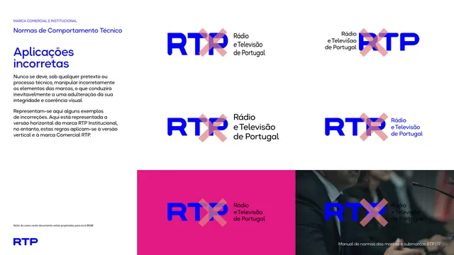
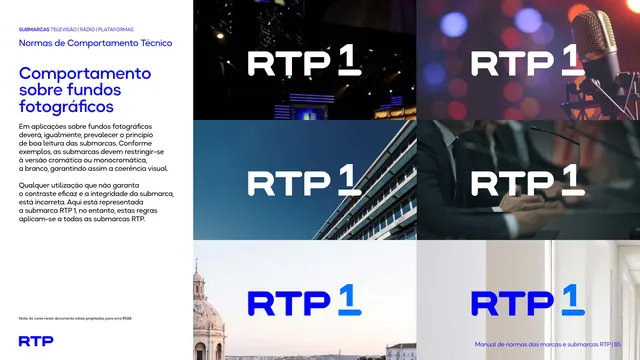
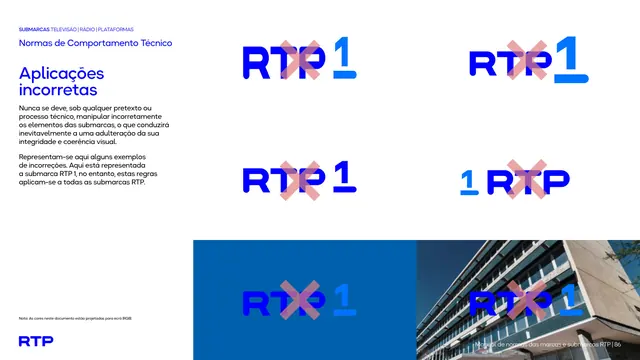
Misuse page marking five incorrect RTP1 logo applications, wrong colors, low contrast, and reversed element order, each crossed out with a translucent red X.
Summary
A "what not to do" page showing five misapplications of the RTP1 lockup, each struck through with a translucent red X, ranging from wrong color combinations to a reordered logo layout on a photo background.
Visual description
White left column carries the eyebrow, black chapter heading, bold blue "Aplicações incorretas" title, and a short explanatory paragraph. The right side shows five example logos crossed out with a soft red-pink X overlay: a mixed blue-tone RTP1 lockup, a purple-toned variant, a reversed-color RTP1 on white, a numeral-first "1 RTP" reordering, and a mismatched blue-on-blue lockup placed over a building photograph in the bottom-right panel, sitting beside a plain solid-blue color block in the bottom-left.
Key takeaway
Marking misuse with a literal red X directly over the offending logo, rather than only describing the rule in text, makes each violation (wrong palette mixing, low contrast, reordered elements) immediately legible without reading the copy.
Reuse notes
A standard, high-utility page type for any brand manual's logo-integrity section. The X-overlay technique works well when paired with the correct-usage pages earlier in the same chapter so readers can compare right versus wrong side by side.
From this deck: RTP1 incorrect usage examples
View deck