Preview image. Unlock full-res
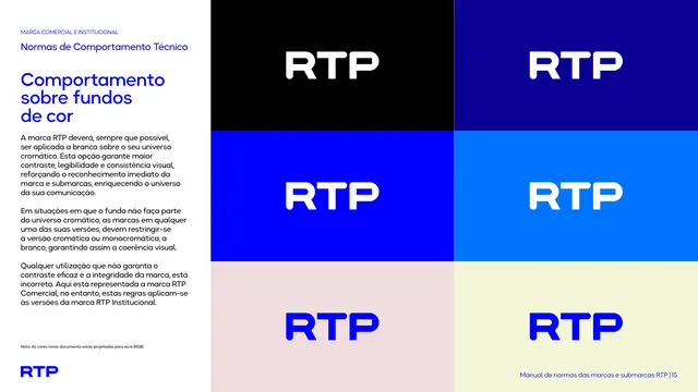
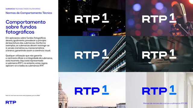
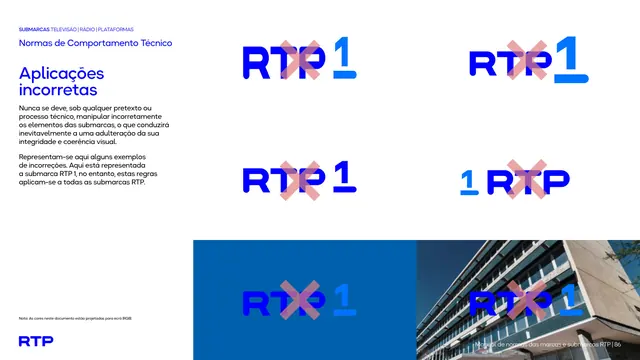
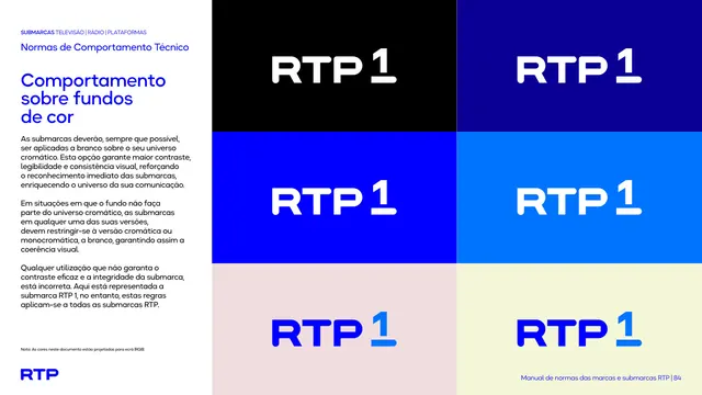
Six-panel grid testing the RTP1 logo's white, blue, and monochromatic-blue versions against black, navy, mid-blue, sky-blue, blush, and pale-yellow color fields.
Summary
A logo-on-color test sheet showing how the RTP1 mark behaves across six different background colors, moving from white lockups on dark fields to blue lockups on pale fields.
Visual description
White left column with the eyebrow, black heading "Normas de Comportamento Técnico," bold blue title "Comportamento sobre fundos de cor," and explanatory body copy. The right two-thirds is a 2-by-3 grid of solid color swatches, each holding the RTP1 lockup: black background with white logo, navy background with white logo, saturated blue background with white logo, lighter sky-blue background with white logo, pale pink-blush background with blue logo, and pale yellow background with blue logo.
Key takeaway
Running the same logo through a deliberate ladder of background colors, from black through the brand blue to pastel tints, makes the "white on dark universe, chromatic blue on light or off-brand universe" rule visually self-evident rather than needing a written exception list.
Reuse notes
A strong, compact format for any brand's "logo on color" page: a fixed small grid of background swatches with the same logo dropped in each, so contrast failures or approved variants are obvious at a glance.
From this deck: RTP1 behavior on color backgrounds grid
View deck