Preview image. Unlock full-res
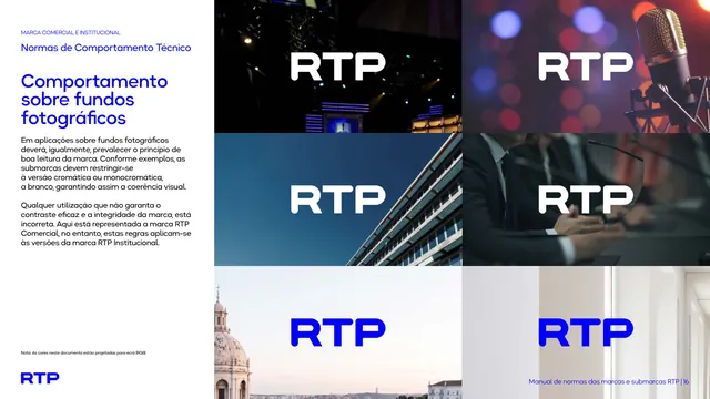
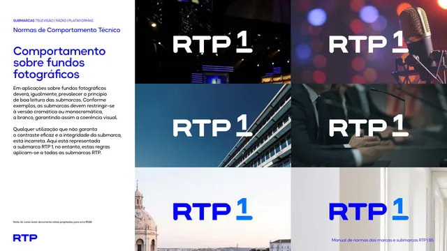
Six-photo grid showing the RTP1 logo placed over studio, broadcast, and Lisbon-landmark photography to demonstrate legibility rules on photographic backdrops.
Summary
A photographic-background test sheet placing the RTP1 mark over six real-world images, a TV studio, a concert with a microphone, a Lisbon office building against blue sky, a suited presenter, a domed church skyline, and an interior corridor, to show how the logo reads on photography.
Visual description
White left column repeats the eyebrow, black chapter heading, bold blue title "Comportamento sobre fundos fotográficos," and short explanatory paragraph. The right two-thirds is a 2-by-3 grid of full-bleed photographs: a dark stage lighting rig, a moody bokeh shot with a studio microphone, a low-angle shot of a modern building against blue sky, a close-up of a suited man speaking into a microphone, a dawn skyline with a domed church silhouette, and a bright interior corridor. Each photo carries the white or blue RTP1 wordmark placed in open sky, shadow, or negative space for contrast.
Key takeaway
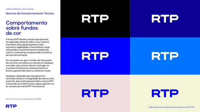
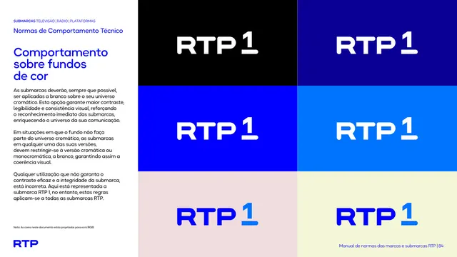
Testing the logo against a spread of real photographic conditions, dark stage, bright sky, warm interior, rather than a single idealized example, proves the white-or-chromatic-only rule holds up in the messier real-world placements a broadcaster actually uses.
Reuse notes
Useful reference for any identity that runs heavily on photography (broadcast, editorial, events): show the mark across a genuinely varied photo set so the "pick whichever contrasts" rule is demonstrated rather than just stated.
From this deck: RTP1 behavior on photographic backgrounds grid
View deck