Preview image. Unlock full-res
Electric-blue contents page listing the manual's two main sections and their page numbers in white Okta Neue.
Summary
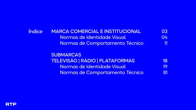
The table of contents, headed "Índice", mapping the manual's two top-level sections (master brand and sub-brands) and their identity-visual and technical-behavior subsections to page numbers.
Visual description
A solid electric-blue page. Centered, a two-column list in white Okta Neue: a left "Índice" label, then section titles with page numbers ranged right. The structure shows "MARCA COMERCIAL E INSTITUCIONAL" in caps with indented "Normas de Identidade Visual" (04) and "Normas de Comportamento Técnico" (11), then a gap, then "SUBMARCAS / TELEVISÃO | RÁDIO | PLATAFORMAS" (18) with the same two indented subsections (19, 81). A small white RTP mark sits bottom left.
Key takeaway
Treating the contents page as another full-color divider rather than a white admin page keeps the manual visually continuous. Indenting subsections under capped section heads, with numbers hard-right, makes the hierarchy instantly legible.
Reuse notes
Use for a contents or index page in a branded document where you want the navigation to feel designed, not utilitarian. The all-caps section heads over sentence-case subsections is a tidy two-level hierarchy worth copying.
From this deck: RTP guidelines table of contents
View deck