
Preview image. Unlock full-res
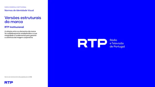
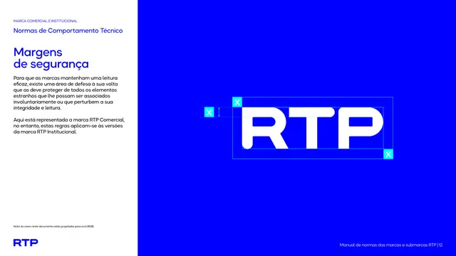
Split page presenting the RTP Comercial wordmark reversed white on a full electric-blue panel, with explanatory text in a white left column.
Summary
Introduces the RTP Comercial structural version of the mark, shown large and white on a full electric-blue right panel, with rationale text on the left.
Visual description
The page splits left-white, right-blue. The blue right half is filled edge to edge and carries the bold white "RTP" wordmark centered. The left white column holds a small blue eyebrow "Normas de Identidade Visual", a two-line blue heading "Versões estruturais da marca", a blue subhead "RTP Comercial", and a short black paragraph on keeping the brand elements consistent. A small note and a blue RTP mark sit at the bottom left.
Key takeaway
The two-zone content template that runs through the whole manual: explanatory copy in a white column against a full-color panel showing the asset at scale. Reversing the wordmark white on the hero blue states the preferred negative application directly.
Reuse notes
A clean way to present a primary logo lockup in a guideline: say it in words on one side, show it big on the other. Reach for this split whenever a spec page needs both a rule and a large specimen. The full-bleed color panel is what gives the logo its presence.
From this deck: Structural versions, RTP Comercial mark
View deck




















More like this








Keep what you find
A free account saves references to boards and can send you a weekly email of picks based on what you save.
To see every result, go Pro.