Preview image. Unlock full-res
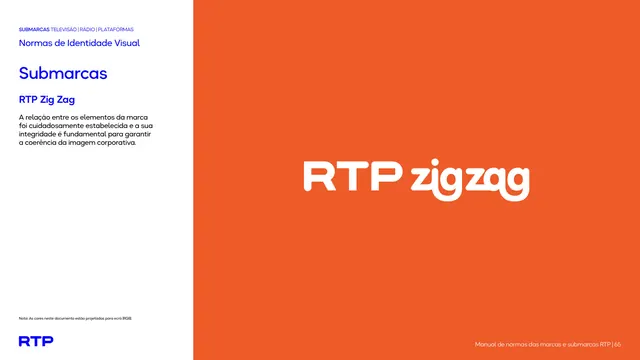
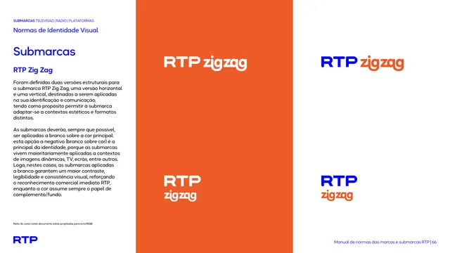
Sub-brand intro page presenting the playful rounded RTP Zig Zag lockup large in white on a full orange-red field.
Summary
The introduction page for the RTP Zig Zag sub-brand, showing the lockup large and white on an orange-red panel, the descriptor set in a noticeably rounder, more playful letterform.
Visual description
Two-zone layout: white text column left with the kicker, "Normas de Identidade Visual", blue "Submarcas" heading, the name "RTP Zig Zag", and one short paragraph. The orange-red panel right holds the white lockup "RTP zigzag", where "RTP" keeps the bold geometric mark but "zigzag" is set in a soft, fully rounded display style with no underscore, a clear tonal break from the other sub-brands.
Key takeaway
Swapping the descriptor typeface to a rounded, bubbly cut while keeping the fixed "RTP" mark is a smart way to flag a children's channel as playful without inventing a separate logo. The brighter orange-red reinforces the energy.
Reuse notes
Use when one product in a family needs a distinct, younger personality but must stay tied to the parent brand; vary the descriptor type, hold the mark. The rounded face is the identifying cue, so keep it consistent.
From this deck: RTP Zig Zag lockup intro
View deck









More like this





Keep what you find
A free account saves references to boards and can send you a weekly email of picks based on what you save.
To see every result, go Pro.