Preview image. Unlock full-res
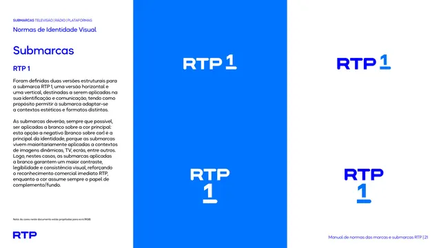
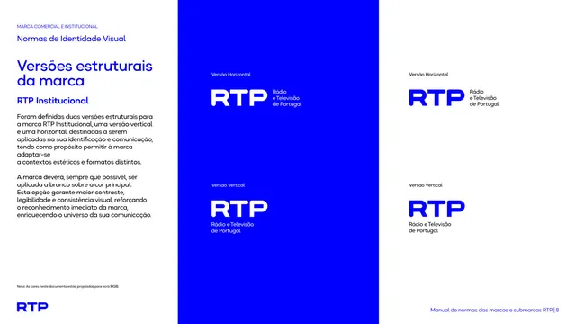
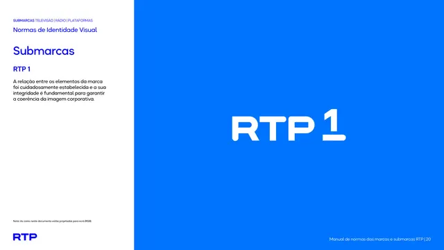
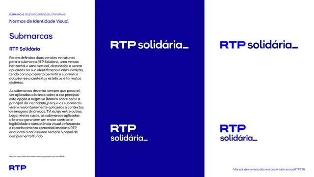
Three-column page showing the RTP1 mark in horizontal and vertical versions, each in white-on-blue and blue-on-white.
Summary
Lays out the two structural versions of the RTP1 mark, horizontal and vertical, each shown white-on-blue and blue-on-white.
Visual description
A three-zone page. The left white column carries the "Submarcas / RTP 1" heads and a black paragraph on the two versions and the white-on-color preference. The center tall blue panel stacks the horizontal lockup (RTP with the numeral 1 to the upper right) above the vertical lockup (RTP over an underlined 1), both white. The right white half repeats both in blue.
Key takeaway
The same horizontal/vertical-by-positive/negative grid used for the master institutional mark is reused for each sub-brand, so every channel is documented identically. The vertical version stacks the numeral beneath the monogram, keeping the underline as a constant cue.
Reuse notes
Use as the structural-versions page for a numbered sub-brand. Reusing the master-brand grid for sub-brands keeps the whole family consistent; copy the layout per sub-brand and only swap the mark and color.
From this deck: RTP1 horizontal and vertical versions
View deck





















More like this








Keep what you find
A free account saves references to boards and can send you a weekly email of picks based on what you save.
To see every result, go Pro.