Preview image. Unlock full-res
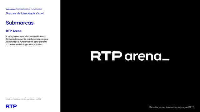
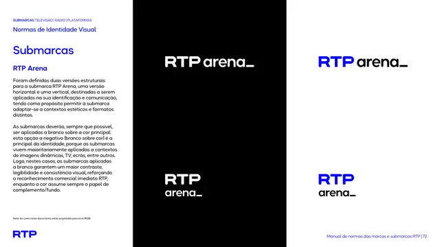
Sub-brand intro page presenting the RTP Arena lockup large in white on a full black field.
Summary
The introduction page for the RTP Arena sub-brand, showing the lockup large and white on a pure black panel, the only black-grounded sub-brand in the set.
Visual description
Two-zone layout: white text column left with the kicker, "Normas de Identidade Visual", blue "Submarcas" heading, the name "RTP Arena", and one short paragraph. The black panel right holds the white horizontal lockup "RTP arena_", bold "RTP" with a lighter "arena" and a trailing underscore glyph.
Key takeaway
Using pure black as the "color" for a sports/live channel makes it feel bold and premium and gives maximum white-on-black contrast; it proves the sub-brand system can include an achromatic member.
Reuse notes
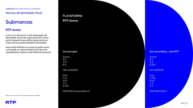
Opening page for the black-grounded sub-brand. The white lockup has the highest contrast of the whole set here. Note its color page lists Process Black rather than a hue.
From this deck: RTP Arena lockup intro
View deck






















More like this







Keep what you find
A free account saves references to boards and can send you a weekly email of picks based on what you save.
To see every result, go Pro.