Preview image. Unlock full-res
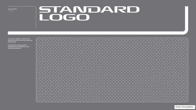
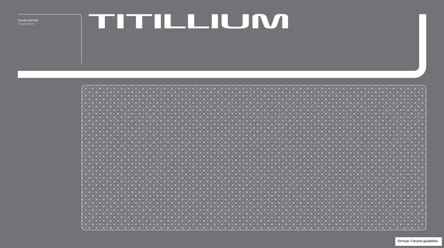
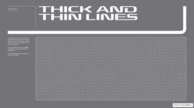
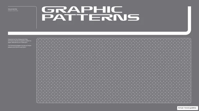
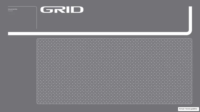
Grey divider with an oversized "GRID" wordmark, a bracket-rule frame, and a fine diamond-lattice grid panel introducing the supporting grid system.
Summary
A grey section-divider for the grid system: an oversized white "GRID" wordmark across the top, framed by a thick white bracket-rule, with a finely patterned diamond-lattice panel filling the lower half.
Visual description
Flat medium-grey slide, visually a twin of the Titillium divider. The small running header ("Visual Identity / System") sits top-left inside a tiny bracketed corner rule. "GRID" is set very large in the bold display sans, all-caps, white, across the upper area. A thick white rule wraps a right angle at lower-left, runs right, then up the far-right edge, forming a large open bracket around the title zone. Below sits a wide rounded-corner panel filled edge to edge with the fine white diamond/cross lattice pattern on grey, the same swatch used on the Titillium page. The deck-slug badge sits bottom-right.
Key takeaway
The consistency of it: the identical divider template (wordmark, wrapping bracket, lattice swatch panel) reused for another section, so a reader instantly recognizes a chapter boundary. Repeating the lattice swatch ties the type and grid sections together as one system family.
Reuse notes
Use as the opener for the grid section, paired visually with the other grey dividers. The strength here is repetition, keep the template identical across sections and let only the wordmark change. The muted grey keeps system chapters calm against the louder red openers.
From this deck: Grid system divider
View deck