Preview image. Unlock full-res
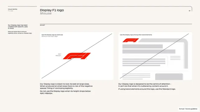
Display logo misuse page on cream with two crossed-out wrong uses (too small below minimum size, and crowded among other brand elements) each with explanatory notes.
Summary
The Display logo misuse page: two crossed-out wrong examples, one showing the logo used below its minimum size, the other showing it crowded among other brand elements.
Visual description
Cream (#F7F3EC) page with the running header ("Visual Identity, F1 Logo", "Display F1 logo / Misuse", page 37) and a "DO NOT" label. The left column gives the principle that the Display logo has specific uses. The right area holds two large rounded white tiles, each struck through with a single diagonal line. The first, "Use the Display logo at small size", shows the red mark at a small "4p0 / 48pt/px" measurement with a note that its negative spaces fill in and lose legibility below that. The second, "Use the Display logo among other brand elements", shows the red mark crowded by grey greeked content blocks, with a note to use the Standard logo when elements surround it.
Key takeaway
Tying the Display logo's two main failure modes (going too small, getting crowded) directly back to the Standard logo as the correct alternative, so misuse guidance also reinforces the system hierarchy. Showing the actual minimum-size measurement makes the limit concrete.
Reuse notes
A focused misuse page for a display/hero logo whose failure modes differ from the workhorse mark. The "use the other cut instead" redirect is a strong pattern for multi-logo systems. Consistent diagonal-strike styling ties it to the rest of the deck's do/don't pages.
From this deck: Display logo misuse and limits
View deck





































































More like this

Keep what you find
A free account saves references to boards and can send you a weekly email of picks based on what you save.
To see every result, go Pro.