Preview image. Unlock full-res
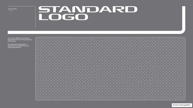
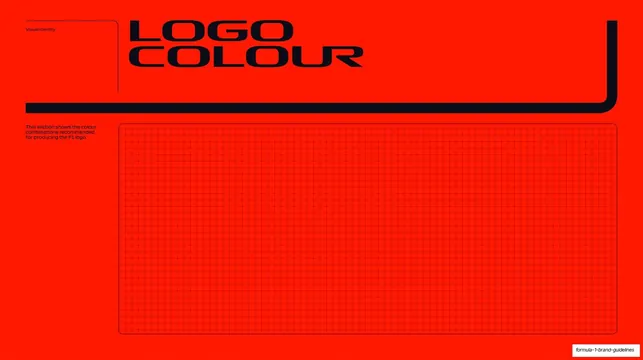
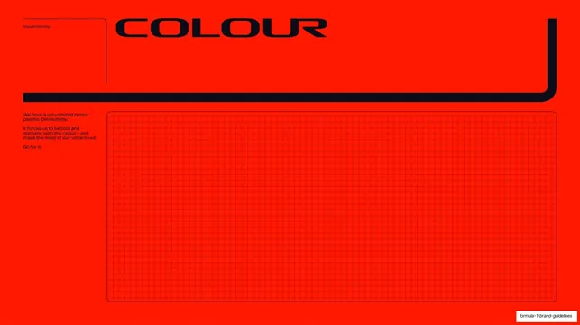
Full-red section divider with an oversized two-line black "BRAND ARCHITECTURE" display headline and a tonal dot-grid panel framed by a black L-bracket.
Summary
A red-field section divider opening the brand-architecture chapter: an oversized two-line black "BRAND ARCHITECTURE" headline in F1's italic display caps, with a short intro note and a tonal dot-grid panel inside a black L-bracket.
Visual description
Full-bleed F1 warm-red background. Top-left a small black "Appendix" label sits inside a thin black-outlined bracket. The headline "BRAND ARCHITECTURE" fills the top in oversized black display caps, slightly italic and forward-leaning, stacked on two lines. A thick black rule underlines the headline and turns up the right edge into an L-bracket. A small black intro paragraph sits at left ("Our brand architecture system leverages the power and equity that exists in our master F1 brand."). The lower two-thirds is a tonal red-on-red dot-grid panel.
Key takeaway
The same divider template flipped to a saturated red field with black type, proving the chapter system works in the brand's accent colour as well as on black. Black-on-red at this scale is loud and unmistakably on-brand.
Reuse notes
A high-energy variant of the section-divider pattern for when a chapter wants the brand's signature colour rather than the dark default. Reuse for any deck that has both a dark and an accent-colour divider state. The oversized italic display cut is doing all the work; keep the field a single flat colour.
From this deck: Brand Architecture section divider
View deck