Preview image. Unlock full-res
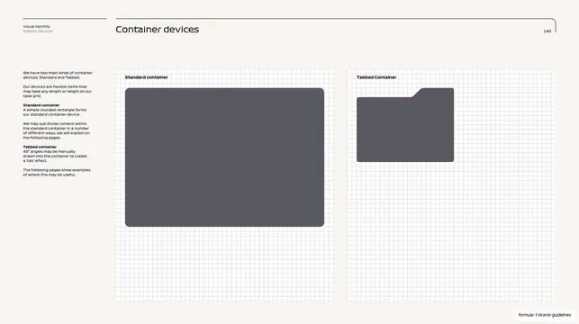
Cream guideline page introducing two container devices, a standard rounded rectangle and a tabbed folder shape, drawn over a faint grid.
Summary
The opening page for the brand's container devices, presenting two shapes side by side: a large standard rounded rectangle and a smaller tabbed folder-like container, both sitting on a faint construction grid.
Visual description
Warm cream (#F4F0E8) page. The standard guideline header runs across the top: a short rule with "Visual Identity / Graphic Devices" top-left, the section title "Container devices" centered-left, page number "140" right, and a long rounded bracket rule sweeping to the top-right corner. A narrow left column holds explanatory body copy in small dark sans with bold lead-ins ("Standard container", "Tabbed container"). The main area is split into two equal panels over a light blue-grey grid: on the left, labeled "Standard container", a large slate-grey rounded rectangle; on the right, labeled "Tabbed Container", a slate-grey shape with a 45-degree-cut tab in its top-right reading as a folder. Both fill grid cells precisely.
Key takeaway
Introducing two related UI primitives on one grid so their relationship and shared corner language is obvious at a glance. The discipline of drawing every device on the visible base grid, which makes the spec feel engineered rather than decorative.
Reuse notes
A clean reference for the intro page of any component or shape system in a brand or design guideline. The sidebar-copy plus grid-panel layout reads well for spec documentation. The tabbed folder device is a distinctive, reusable container idea for grouping or "more info" content. Pairs with the sizing and misuse pages that follow.
From this deck: Container devices intro slide
View deck









































































































More like this



Keep what you find
A free account saves references to boards and can send you a weekly email of picks based on what you save.
To see every result, go Pro.