Preview image. Unlock full-res
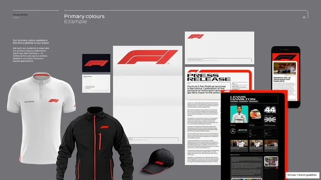
Grey page showing the red/black/white palette applied across polo shirts, jacket, cap, stationery, press release and device screens.
Summary
A colour-in-context page showing the primary palette across real branded items: white and black polo shirts, a softshell jacket, a cap, business cards, letterhead, a press release and phone and tablet screens.
Visual description
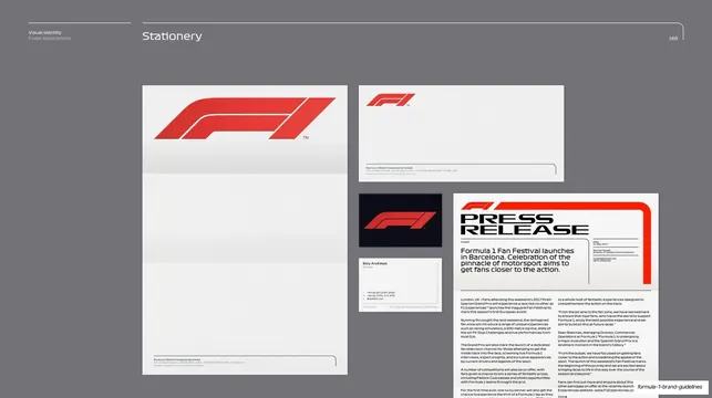
Mid-grey background, light header ("Visual Identity / Colour", "Primary colours" with grey "Example" subhead, page 62). A short left-column intro states the primary palette is the entry palette used in fixed F1 applications. The right area is a loose masonry collage of photographic and rendered product shots: a white polo and a black softshell jacket and cap on the left carrying the small red F1 mark, then a central stack of white stationery (a card pair, a sheet with the red logo, and a "PRESS RELEASE" template using a red headline block), and on the right a black smartphone and a tablet showing red-accented F1 content UI. Items are arranged at varied scales against the neutral grey so the recurring red accent ties the spread together.
Key takeaway
Proving a palette by collaging it across the full touchpoint range in one frame: apparel, print, stationery and screen. The neutral grey backdrop lets the single red accent register as the connective thread across very different objects.
Reuse notes
A persuasive "palette in the wild" page for brand decks and pitch decks alike. The mixed-scale masonry of photographed and rendered mockups reads as a mood-and-application board. Needs decent product photography or mockups to land; the grey ground is a safe stage for almost any accent colour.
From this deck: Primary colour palette in application
View deck










































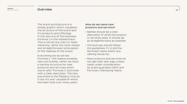
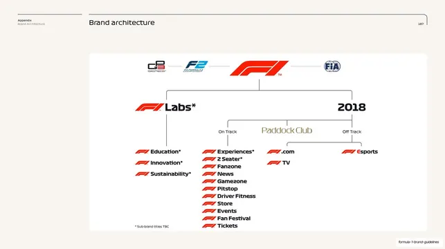
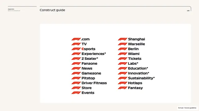
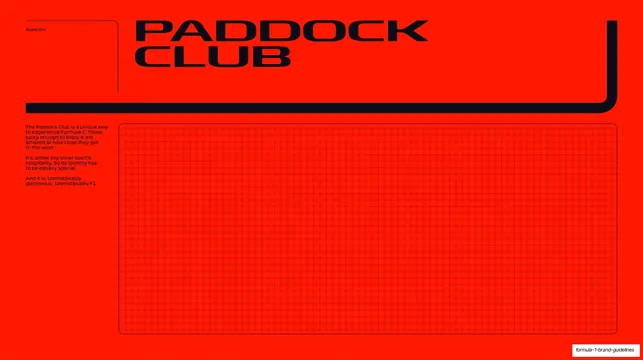



More like this



Keep what you find
A free account saves references to boards and can send you a weekly email of picks based on what you save.
To see every result, go Pro.