Preview image. Unlock full-res
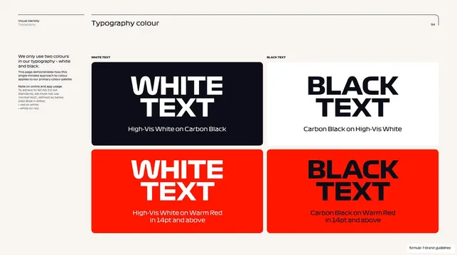
Cream slide showing four rounded swatch cards of WHITE and BLACK text set on black, white, and red, with a WCAG accessibility note.
Summary
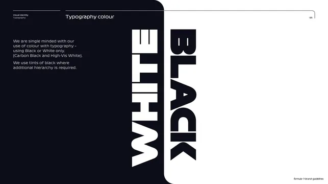
A specimen slide demonstrating the only approved type-colour combinations as four large rounded swatch cards, paired with a left note on WCAG-safe usage online.
Visual description
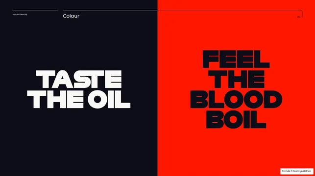
Warm off-white (cream) background with the standard hairline header and page number "94". A narrow left column explains that only two type colours are used, white and black, and adds a note that to meet WCAG 2.0 AA standards red-on-white and white-on-red must not be used below 14pt Bold. To the right sit four large rounded-corner swatch cards in a 2x2 grid under tiny all-caps labels "WHITE TEXT" and "BLACK TEXT": top row is "WHITE TEXT" reversed on carbon black and "BLACK TEXT" on high-vis white; bottom row repeats both on a saturated warm red, each captioned ("High-Vis White on Carbon Black", "Carbon Black on Warm Red in 14pt and above", and so on). Headline words are set in the heavy condensed display face, sub-captions in a lighter weight.
Key takeaway
Pairing each approved colour combination as its own full rounded card, with the demonstrated text actually set in that combination, so the spec doubles as a live specimen. Folding the WCAG minimum-size caveat right next to the swatches keeps the accessibility rule attached to the visual.
Reuse notes
A clean template for any brand or design system page that has to lock down legible text-on-colour pairings. The 2x2 card grid scales to more combinations; keep the captions explicit about colour names and size limits. Strongest when the brand colour (here warm red) is the constrained case the rule is protecting.
From this deck: F1 type colour combinations slide
View deck



























































































More like this


Keep what you find
A free account saves references to boards and can send you a weekly email of picks based on what you save.
To see every result, go Pro.