Preview image. Unlock full-res
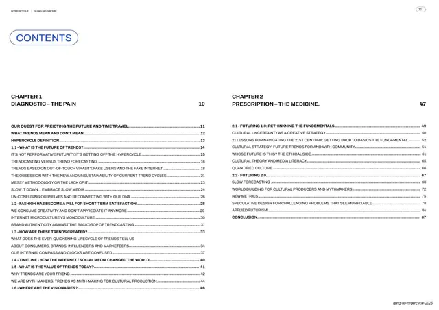
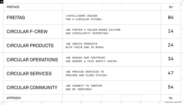
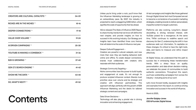
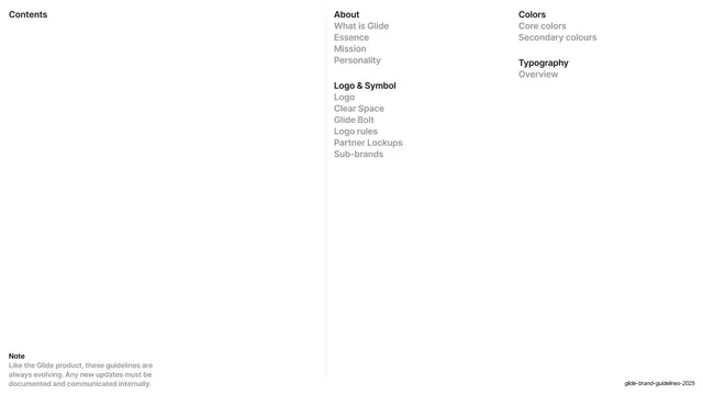
Three-column cream contents page listing major sections and sub-pages with dotted leaders and page numbers.
Summary
The first contents spread: a dense three-column index running from Our Story through Visual Identity, logo specs and into Typography, with dotted leaders and page numbers.
Visual description
Cream (#F4F0E8) ground with the standard running header and rounded corner bracket; the all-caps title "Content" sits centre with page number "3". Below, three columns of contents. Section headings ("OUR STORY", "VISUAL IDENTITY", "F1 LOGO", "STANDARD LOGO", "DISPLAY LOGO", "MICRO LOGO", "COLOUR", "TYPOGRAPHY") are set slightly larger with their page number bold at the right; indented sub-entries follow in a lighter weight. Every line uses a fine dotted leader connecting the label to its page number. The type is small, evenly leaded and strictly aligned to the column grid.
Key takeaway
Compressing a 200-page document into one screen with a clean three-column index, using weight (bold section headers vs light sub-items) rather than colour or rules to build hierarchy, and dotted leaders to keep long lines readable.
Reuse notes
A dependable contents pattern for any long manual, report or brand book. Works only with a tight grid and disciplined alignment; the dotted leaders and consistent indent are what make the density legible.
From this deck: Table of contents (Our Story to Typography)
View deck