Preview image. Unlock full-res
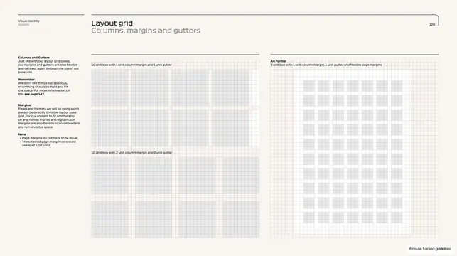
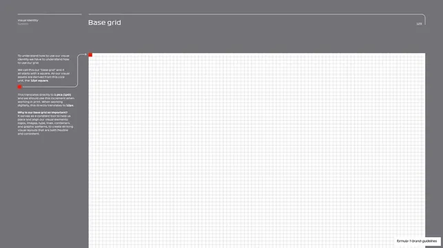
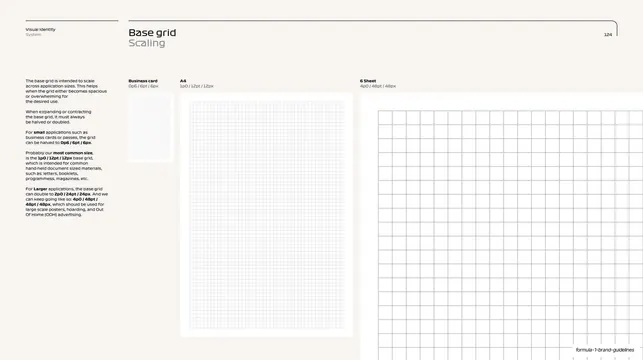
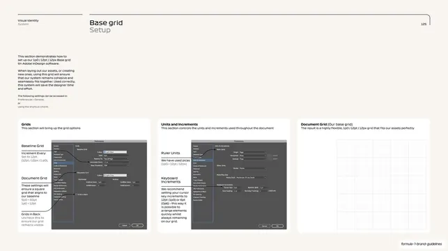
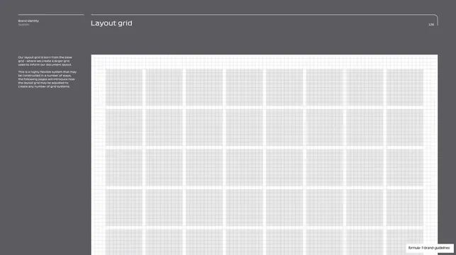
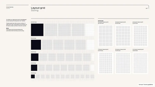
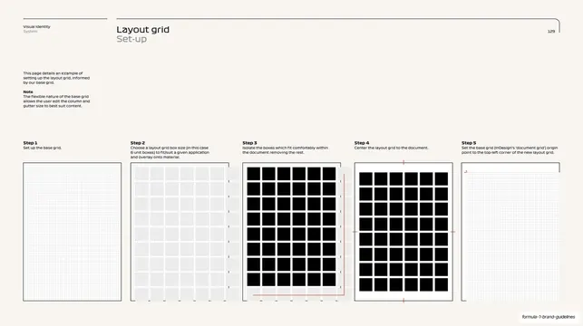
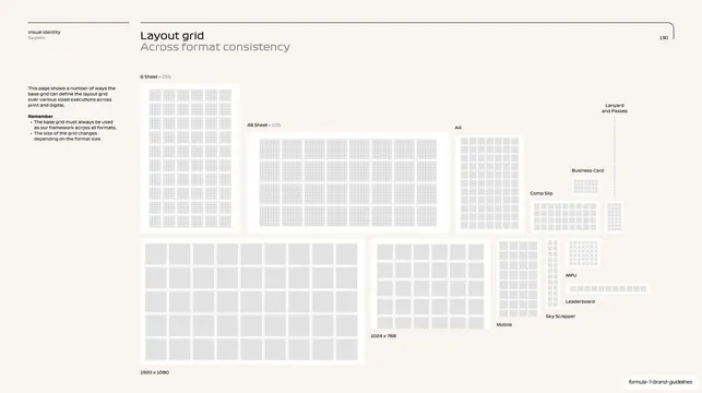
A layout-grid page detailing columns, margins and gutters, with two large annotated column grids and a tall A4 grid alongside a left copy column.
Summary
A spec page explaining how the layout grid resolves into columns, margins and gutters, with two stacked large column-grid diagrams on the left and a tall A4 column grid on the right.
Visual description
Warm off-white background, thin top rule with the "Visual Identity / System" kicker, "Layout grid" title with an outlined "Columns, margins and gutters" subtitle, and "128" at right. A narrow left column carries several labelled paragraphs ("Columns and Gutters", "Remember", "Margins", "Note") with key terms bolded and a cross-reference. The center holds two stacked wide grid diagrams, each captioned: "10 Unit box with 1 column margin and 1 unit gutter" above "10 Unit box with 2 column margin and 2 unit gutter"; both show a fine square grid with light-grey column fills and white margins and gutters. The right third shows a single tall A4-proportioned grid captioned "3 unit box with 1 unit column margin, 1 unit gutter and flexible page margins". All diagrams use thin lines and soft grey fills.
Key takeaway
Showing the same grid resolved two ways, stacked and captioned with their exact margin and gutter values, teaches the rule by direct comparison. Keeping the verbose explanation in one slim margin column lets the diagrams carry the page.
Reuse notes
A reusable pattern for the "how the grid actually works" page in a brand or design-system book. The captioned comparison diagrams suit any rule that has multiple valid settings. Information-dense; rely on consistent caption phrasing and fine line weights to keep it readable.
From this deck: F1 layout grid columns, margins and gutters
View deck































































































More like this


Keep what you find
A free account saves references to boards and can send you a weekly email of picks based on what you save.
To see every result, go Pro.